The Visualization module contains multiple different tabs to help trend, diagnose, and analyze the solar plant operational and performance data. These modules are:
- Heatmap
- Scatter
- Outlier
- Performance
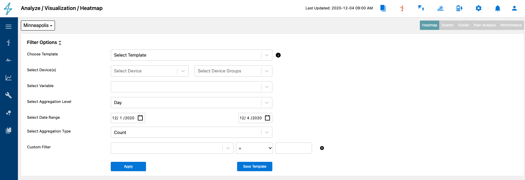
The Heatmap tab allows users to quickly compare the magnitude any data tag available over a specific time period as a color in two dimensions. Users can access the Heatmap tool by selecting the Analyze then Visualization on the left toolbar. From there Heatmap can be selected from the different tab options on the top right.
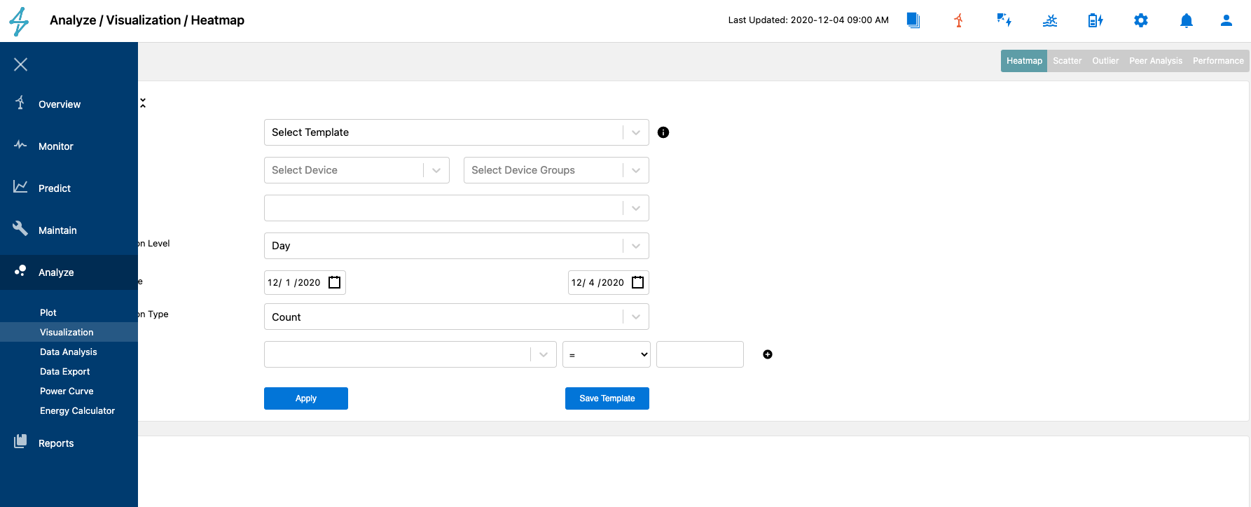
Once on the Heatmap tab, users can select their desired device(s), variables, aggregation level, date range, and aggregation type.
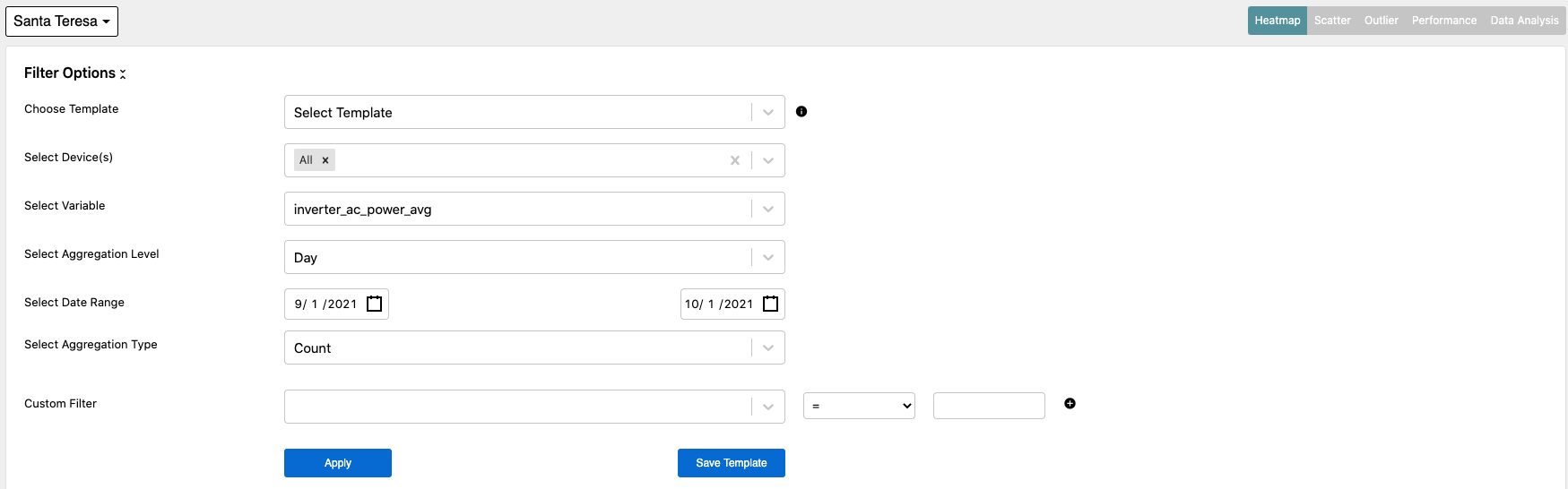
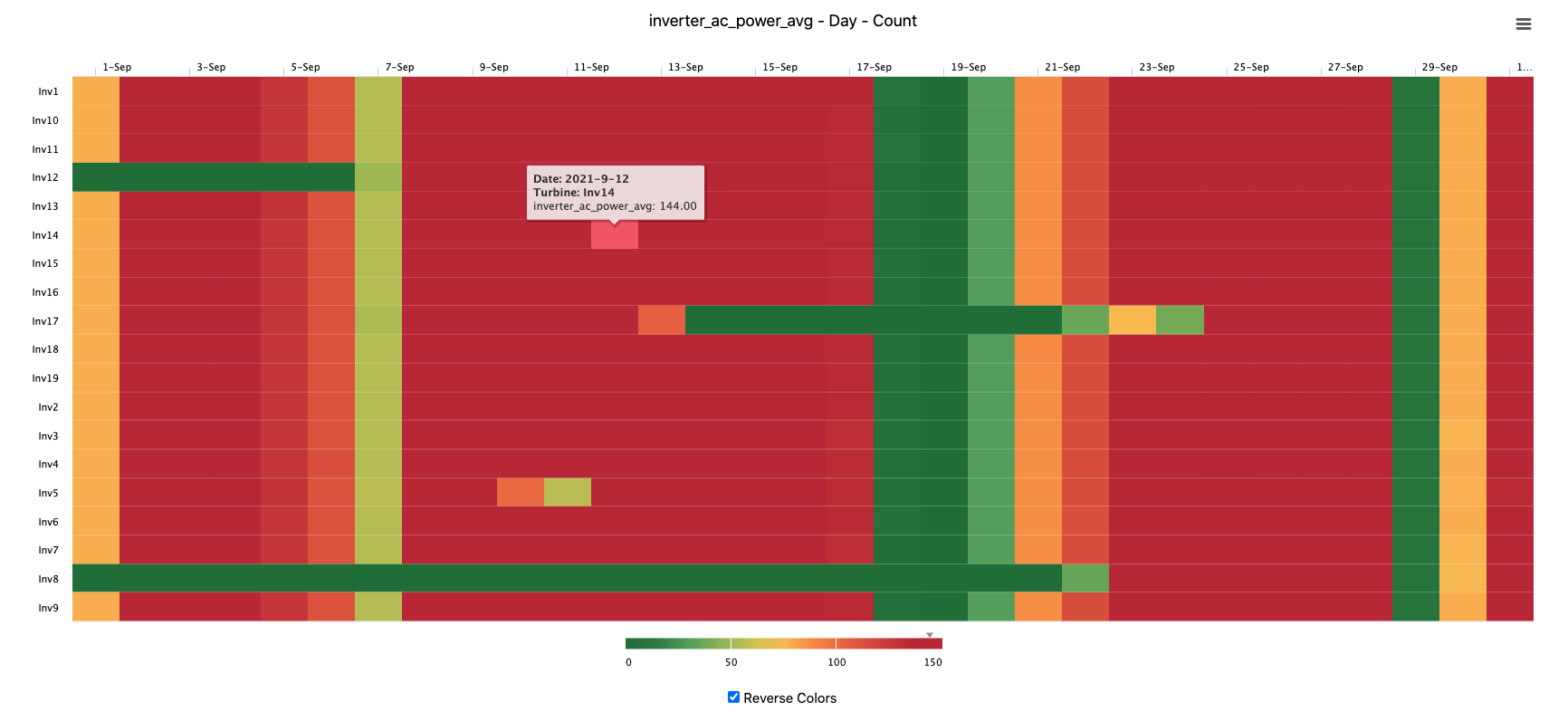
Changing the aggregation type can significantly alter the outcome of the heatmap. By selecting Count, users can get a view into the data quality at the site. In the following example, we have selected to produce a heatmap for all inverters at the site, focusing on AC power, with a daily aggregation, and an aggregation type of Count.
The resulting heatmap is shown below. From the result users can see that on September 18, 19, 20, and 21, it looks as though there was a site communications outage or offline event that effected all inverters. Since this is a Count aggregation, each day for a specific device tag should represent 144 data points as they are 10 minute data intervals. Less than 144 data points per day results in a different shade of color, red being the worst, dark green the best.
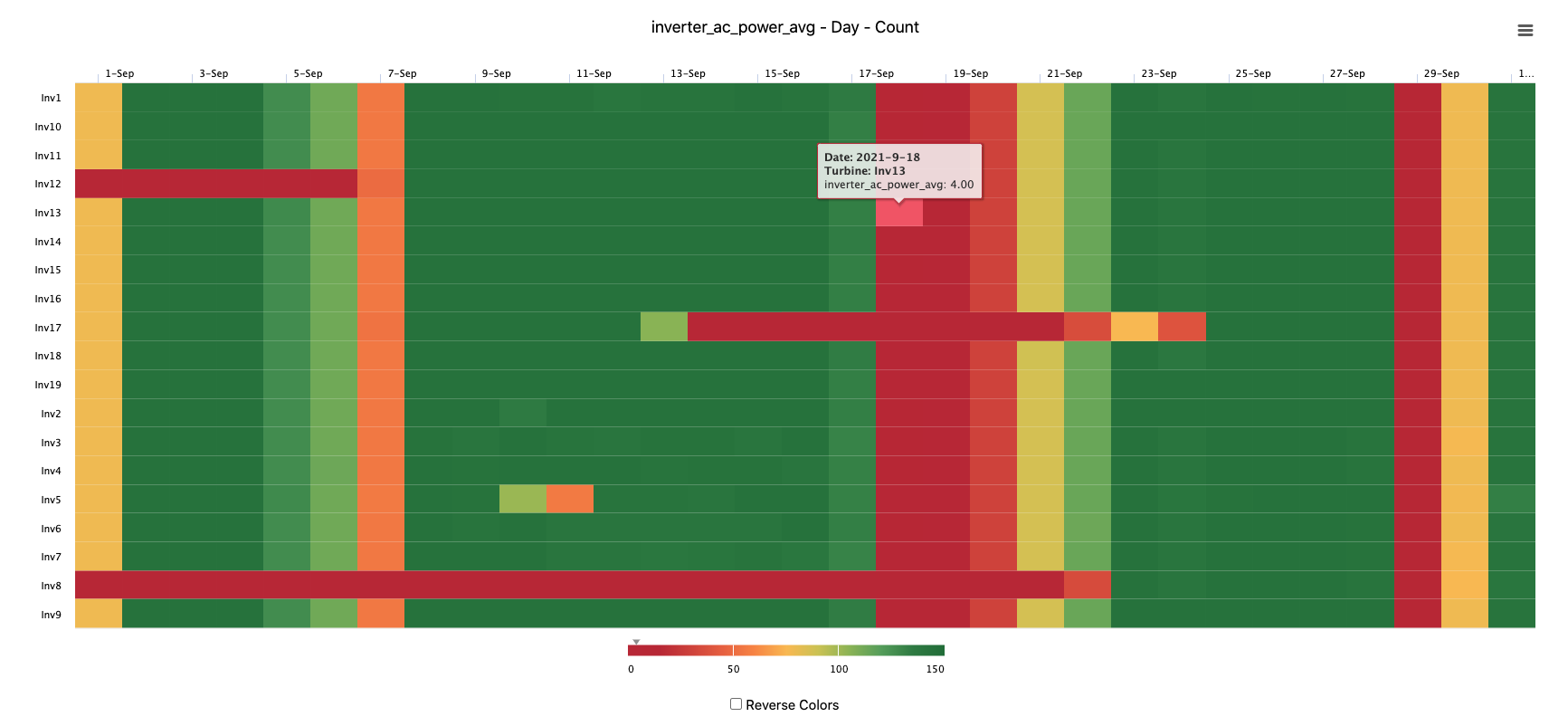
By selecting the reverse colors box below the heatmap, users can invert the colors from the above version if desired.
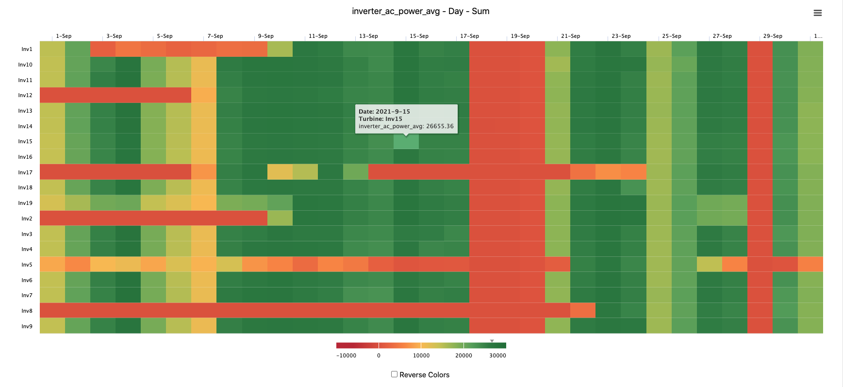
The Min, Max, Sum, and Average aggregators can be used to judge plant or device performance. Taking the same plot as above, but changing the aggregator to Sum allows users to compare daily inverter production values against each other. This is helpful to identify consistently underperforming inverters against their peers. In the image below, inverters 5 and 8 both appear to have some consistent shortfalls through the first half of the month.
Similar to other visualization tools in the platform, users can download the data or an image of the heatmap by selecting the menu on the top right above the heatmap.
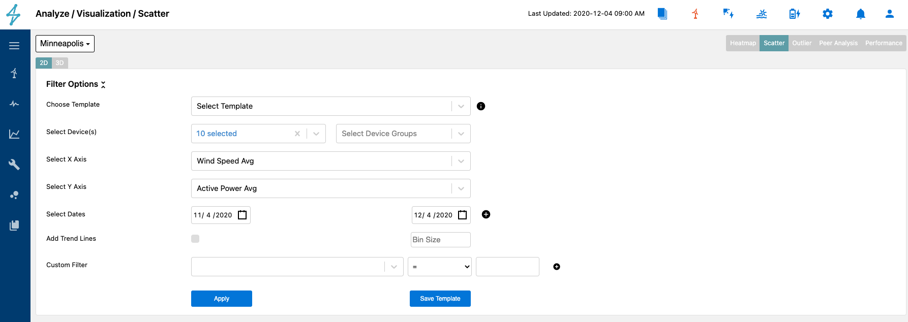
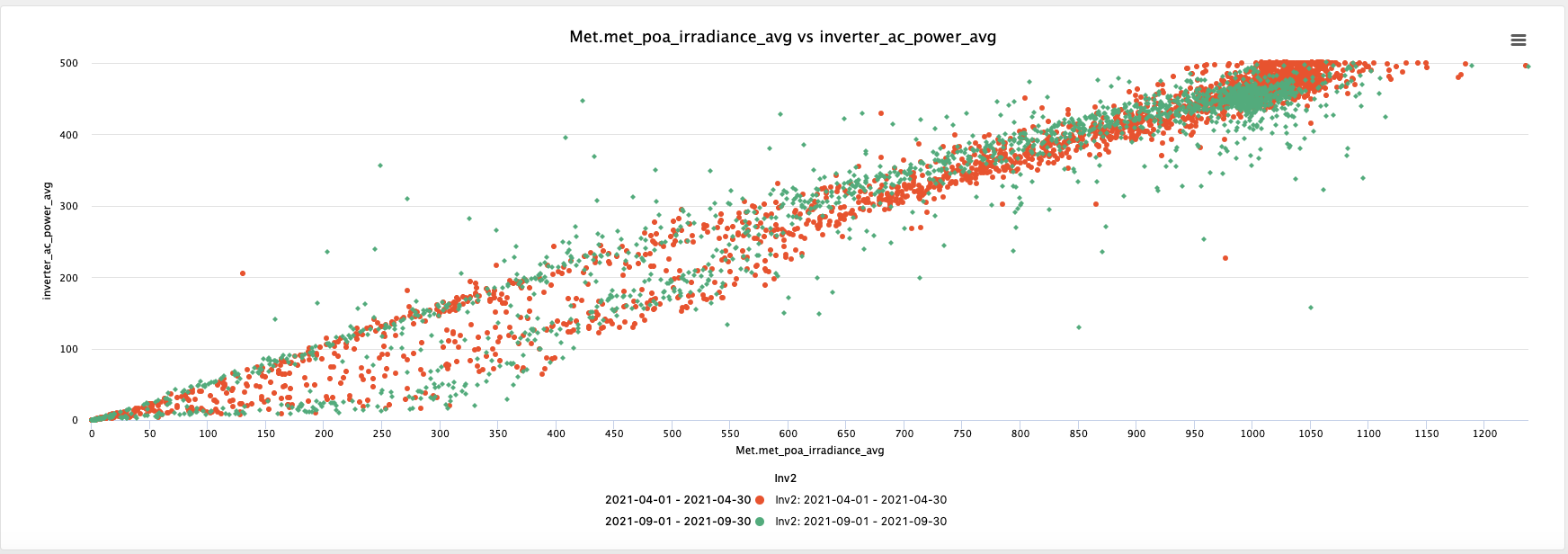
The Scatter module is the next tab over from the Heatmap module. This module allows for users to create a scatter plot of any data points available in the platform over specific date ranges for specific devices at the site.
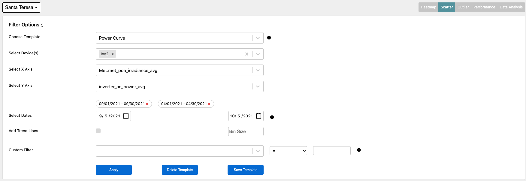
An important feature of the Scatter module is the ability to plot data for multiple different date ranges on the same plot. This allows users to compare changes in behavior over different time periods. In the example below AC power was trended against plane of array irradiance over two separate time periods. This helps to diagnose and shifts due to seasonal changes or degradation in the array.
In the plot users can see a slight shift from April 2021 to September 2021. This is most likely due to seasonal irradiance changes.
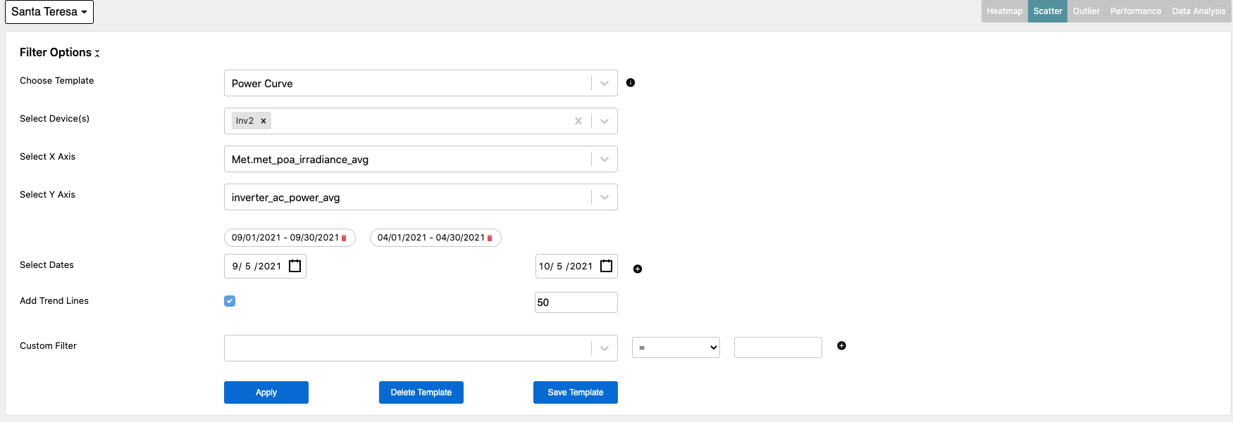
Trend lines can also be added to the plot by selecting the box to add a trend line and designating a bin size. Data can be filtered out by selecting a custom filter.
The plot shown below includes the trend lines added. To remove the scatter data points, just click on the data set desired to remove in the legend below the plot.
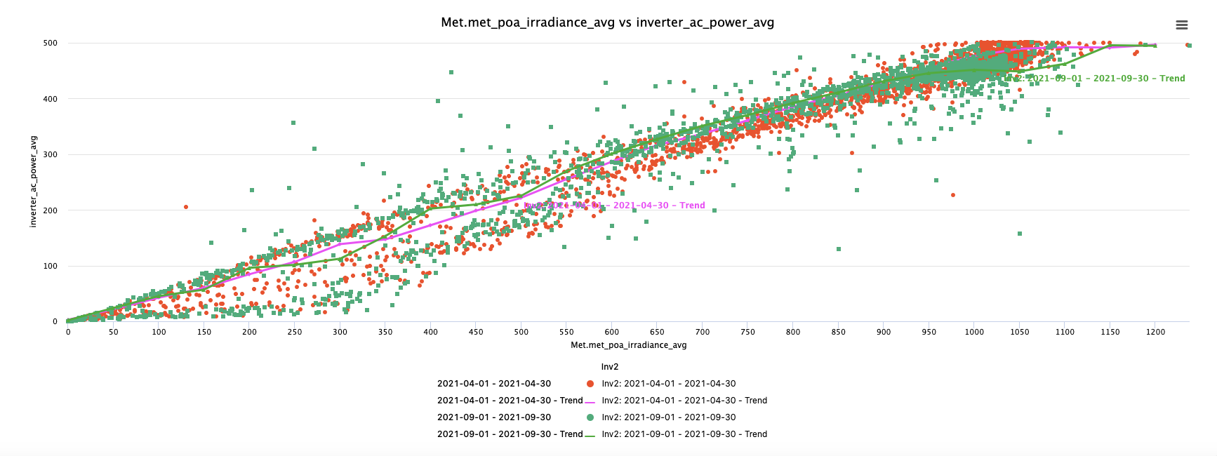
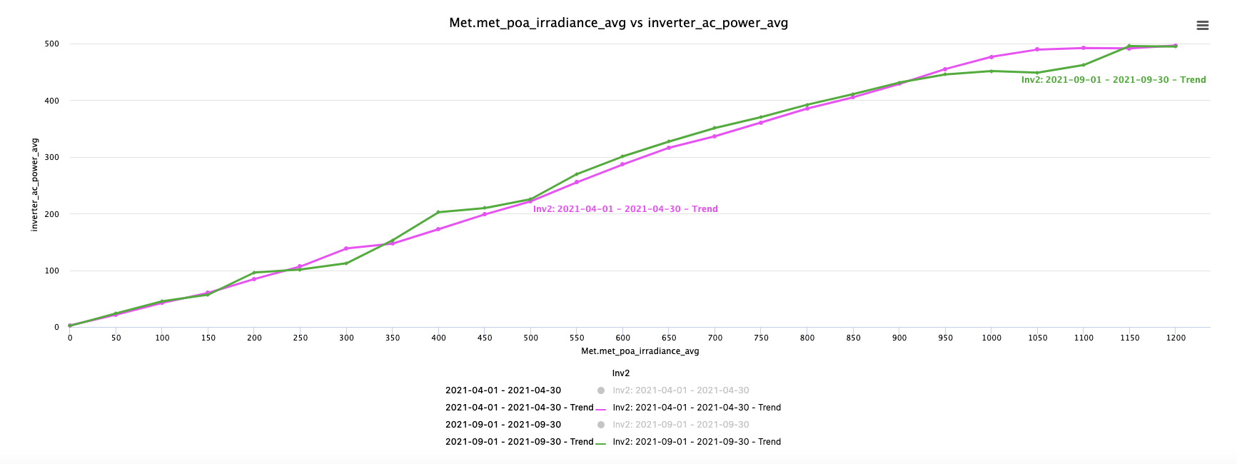
With the scatter data removed, it can be seen that the lines trend relatively closely for the two different time periods.
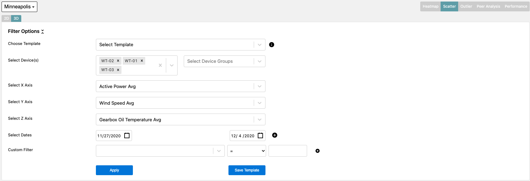
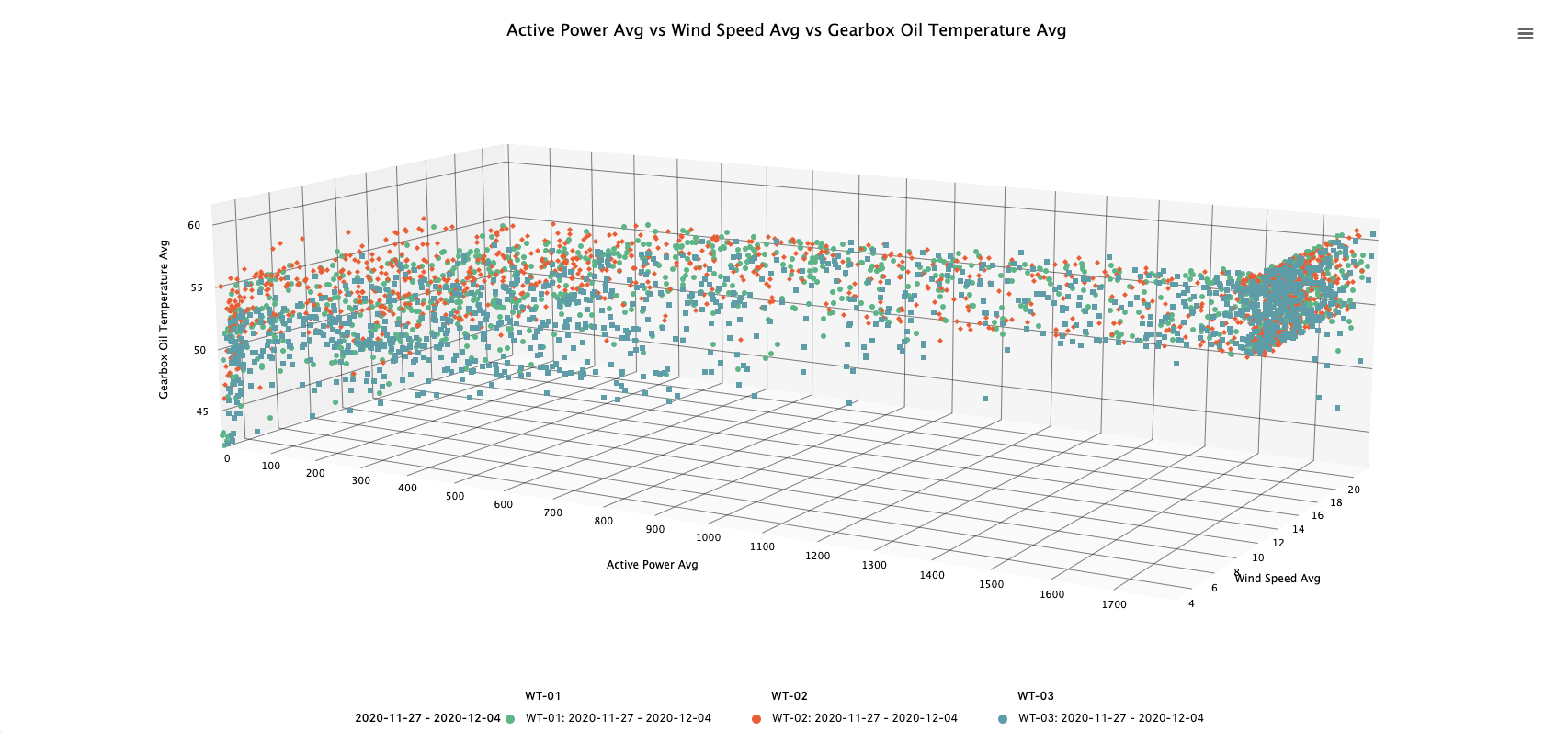
Scatter can also be used in 3D this is done by selecting the 3D tab and selecting an additional Z-Axis variable.
In this example, Active Power, Wind Speed Avg, and Gearbox Oil Temperature Avg are plotted. This can be very helpful for seeing if there is an additional relationship beyond a simple x-y relationship.
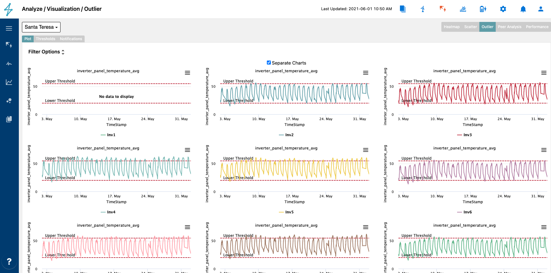
The Outlier plotting tool helps users to determine if certain data points are exceeding user designated upper and lower thresholds.
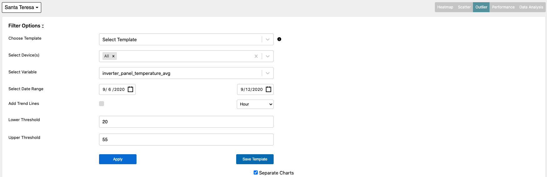
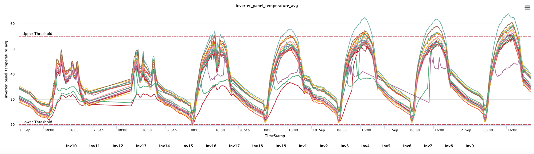
Below is a plot of panel temperatures over a specified time range with specified upper and lower thresholds.
Users can also separate the charts to allow for easier viewing of those devices that trend outside of the specified bounds. This is done by checking the Separate Charts box at the top of the plot.
The Peer Analysis tab allows for X - Y plotting of multiple devices against another specified device. This can be helpful for determining how a specific device is performing compared to another or how different parameters stack up over a specified time and specific device.
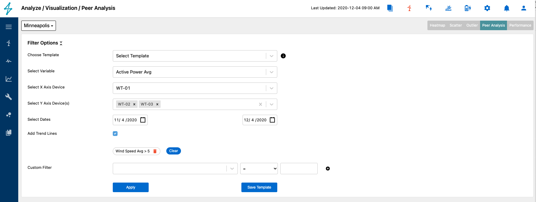
Users will need to select the following to create the peer analysis.
- Variable: Variable for which the peer analysis is conducted
- X Axis Device: Single device for the x axis of the plot
- Y Axix Device(s): Device or devices for the y axis
- Dates: Date range for which the analysis will be conducted
- Add Trend Lines: Optional ability to add trend lines for each set of device data
- Custom Filters: Any specific filtering can be added here, for example wind speeds > 5 m/s
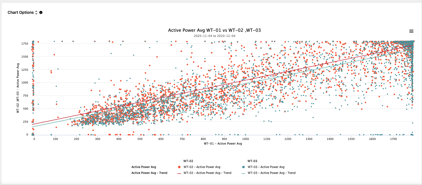
Once the parameters have been set, the peer analysis will be plotted below the Filter Options. Here users can download images of the plot and export the plot data. Data sets can be turned on and off by selecting and deselecting them in the legend.
The performance tab allows for the plotting of various KPIs associated with the asset performance. These KPIs can be plotted in bar, line, or scatter format daily or monthly. Another attribute of this tab is the ability to overlay multiple plots by adding multiple KPIs on the same axis or plot them on a secondary axis to allow for appropriate scaling.
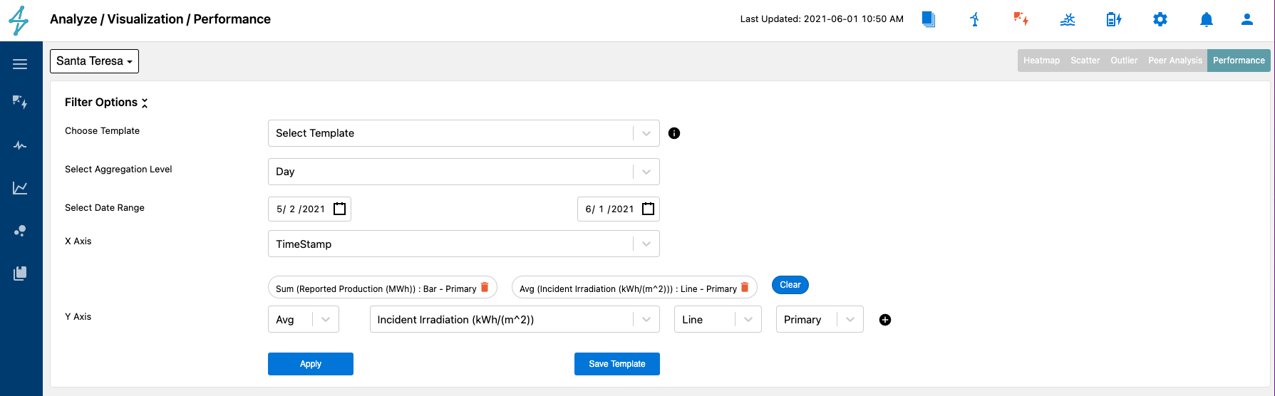
Users can choose to plot data sets as a bar, line, or scatter depending on the their preference or visualization desired.
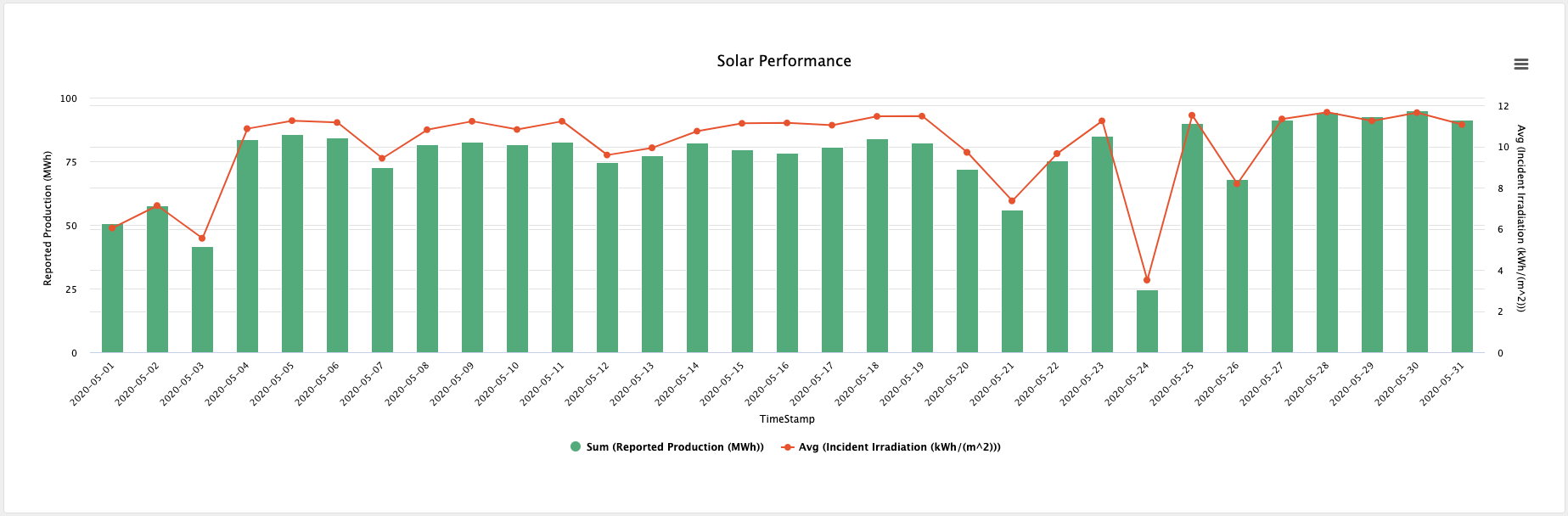
Users can select from numerous performance metrics and measurements to create graphical comparisons.