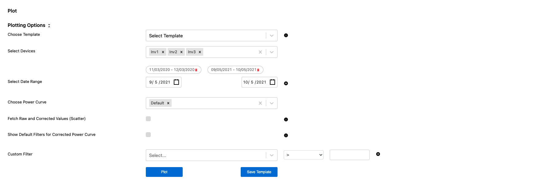
The Power Curve module allows users to easily create trends for analyzing device level performance, whether it is a wind or solar asset. This is a helpful tool for insight into how specific devices are performing against each other as well as a default power curve model.
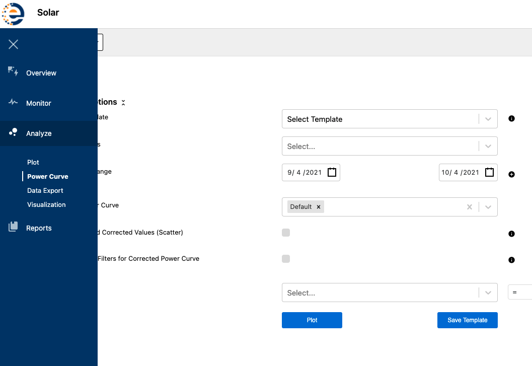
The Power Curve Module can be accessed from the left toolbar under Analyze.
In the Power Curve Module users can select from different devices, custom or multiple date ranges, power curve models, and even add custom filters.
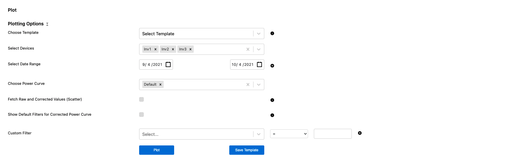
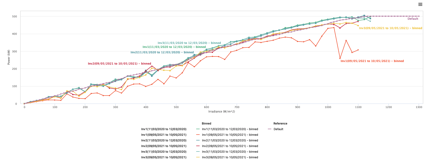
In this scenario, Inverters 1, 2, and 3 have been selected to be compared against the default power curve for the site.
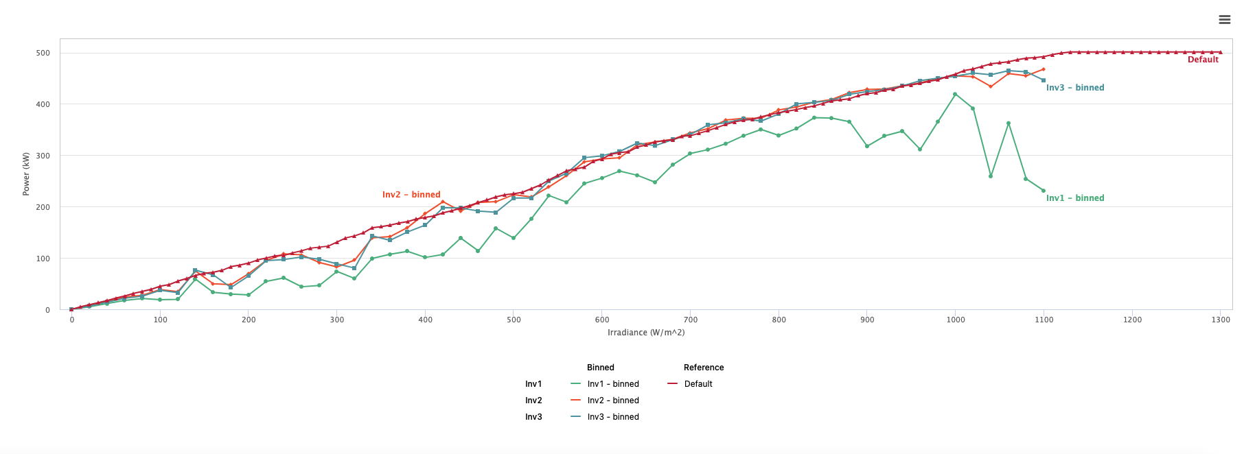
Looking at the power curve plot it seems that Inverters 2 and 3 trend fairly close to the default power curve, but Inverter 1 looks significantly lower. This is a cause for further investigation.
Users can also trend inverter power curves over multiple different time periods to see different seasonality effects in the power curves. This helps to diagnose if specific inverter power curves have always trended low or if it is a recent phenomena.
In the plot below, the same 3 inverters from the above example have been trended over two different time periods. For the earlier time period Inverter 1 was trending in alignment with the other two inverters, showing that the plot of the recent data trending low is due to more recent issues, downtimes, or faults with the inverter, trackers, or DC field.
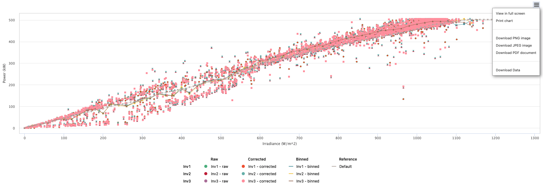
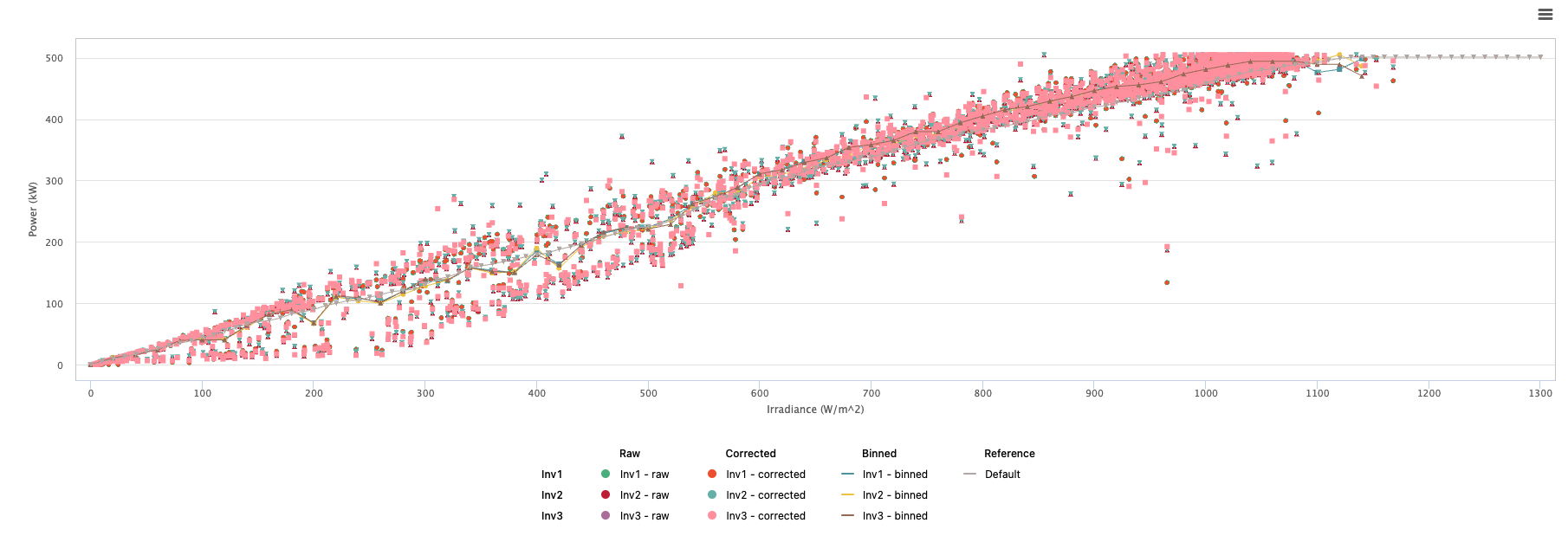
Users can also select to pull Raw and Corrected Values to compare against the binned trend lines for selected Date Ranges by checking the boxes next to each category.

The result is shown in the image below. Data sets can be turned on and off by selecting and deselecting them on the legend below the plot.
Like in the Plot Module and other modules in the Analyze Tab, users can download images of the power curve plot or export the data used by opening the menu in the top right above the plot. They can also save the power curve plot criteria as a template for future use cases.