Power Curves are a helpful plot to explore how the wind turbine power performance varies with wind speed. While a simple plot, there are many filters that can be applied to the data and specificity of power curve or wind speed signal that can convey the nuances of performance.
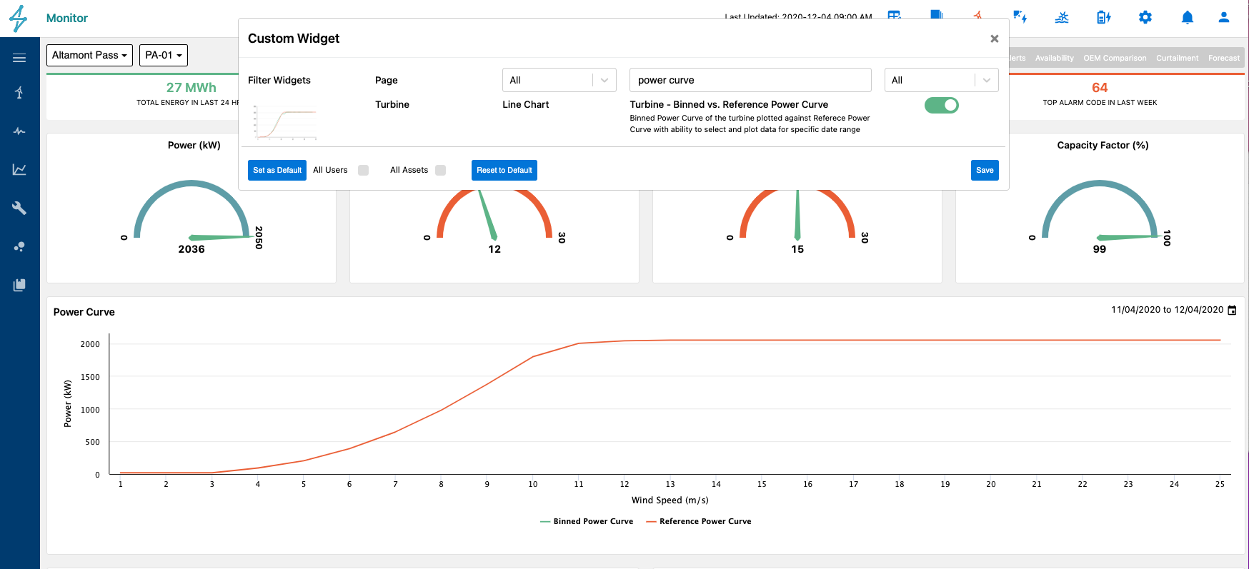
Under Monitor / Asset you can find the Device Overview page when selecting a particular device (turbine). You can configure the dashboard to include a widget called “Turbine - Binned vs. Reference Power Curve” which is a power curve plot similar to the power curve module with a set of default assumptions. These are explained further in the power curve module documentation below but essentially provides a plot of the power vs wind speed utilizing the default power curve as reference power and the air density corrected wind speed vs actual power binned based on the default filters. All these default settings are configurable HERE.
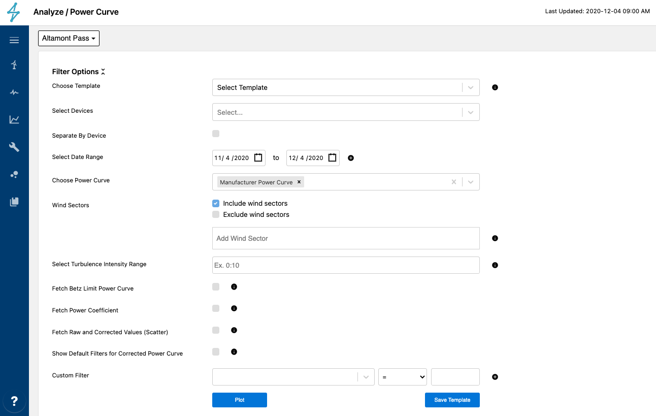
The Power Curve module under the Analyze menu allows you to plot the raw datapoints, filtered datapoints as well as bin those into a curve that allows you to compare against a reference power curve. Below are the details related to specific options in the module.
-
Selecting devices enables you to select a single, multiple, or all turbines. Devices groups enables a quick selection of pre-defined groups of devices. For more information on device groups see HERE.
-
Select date range allows you to plot multiple date ranges. By selecting the start and end dates and hitting the plus button, you can add that date range and do the same to continue to layer additional ranges. Each date range will be added as separate lines/scatter datasets in the plot and you can toggle them on/off in the legend. You only have to select the plus button when you are plotting multiple periods. The default range is set to the most recent month.
-
Choose power curve provides you with a default selected curve as well as a drop down to select a different or additional power curve to display. The options as well as the default setting are configured in the admin / power curve page. For documentation on uploading additional power curves or changing the default power curve, see HERE.
-
Choose Wind Speed Signal provides you the optionality to choose a wind speed signal that differs from the default option. The drop down can be configured on the admin / power curve page (documentation HERE) to add additional wind speed signals from the device tag mapping lists or set a new default. The admin page enables you to hide this drop down altogether if you only want users of that asset to be able to plot power curves with a consistent default wind speed tag. Therefore if this option is missing from the input fields, this is the cause. The default settings are adjusted in the admin page and impact every user for that asset. SparkCognition calculates a corrected wind speed tag that corrects the primary anemometer wind speed signal for air density. This is typically the default setting. An example use case for wanting optionality in wind speed signal used in the power curve could be when a user wants to compare the power curve using the corrected wind speed with the power curve using the estimated wind speed provided by an OEM tag.
The plot will bin a set of corrected values into a cleaner curve to compare to the reference power curve. The
following filters are applied to filter that data: -
Wind Sectors is a filter that can be applied to the corrected values. The sectors are specified in degrees and as a range with a colon (:) as the separator. So entering 0:90 would mean the N to E corner of the compass from the perspective of the nacelle’s direction. Please note that if the turbine nacelle direction is not calibrated to true North, this filter will not work as intended.
-
Select Turbulence Intensity Range is also a filter that applies to the corrected values. Turbulence Intensity is a percentage defined as standard deviation of the wind speed divided by the average wind speed over the timestamp interval time period (10min). The filter is a range using a colon (:) as the separator, so if you enter 5:15 you are specifying to only include data points from timestamps with 5-15% turbulence intensity. This is useful if you are comparing to an OEM power curve that is valid between a certain turbulence intensity range.
-
Show default filters for corrected power curve is a checkbox that shows and allows you to edit the filters applied to the corrected binned power curve. These defaults are set in the configurations page of Admin / Device / Power Curve and more documentation to change those is found HERE. If you want to change these filters on the power curve module, you can remove filters and it will only impact the plot. The circle arrow symbol that appear when the checkbox is selected, allows you to reset the filters back to the default.
-
Custom Filters allow additional filters to be added. These will again impact the corrected power curve.
The following inputs are features that help determine what to display on the chart. The default will display the
binned corrected power curve and the selected reference power curve(s). -
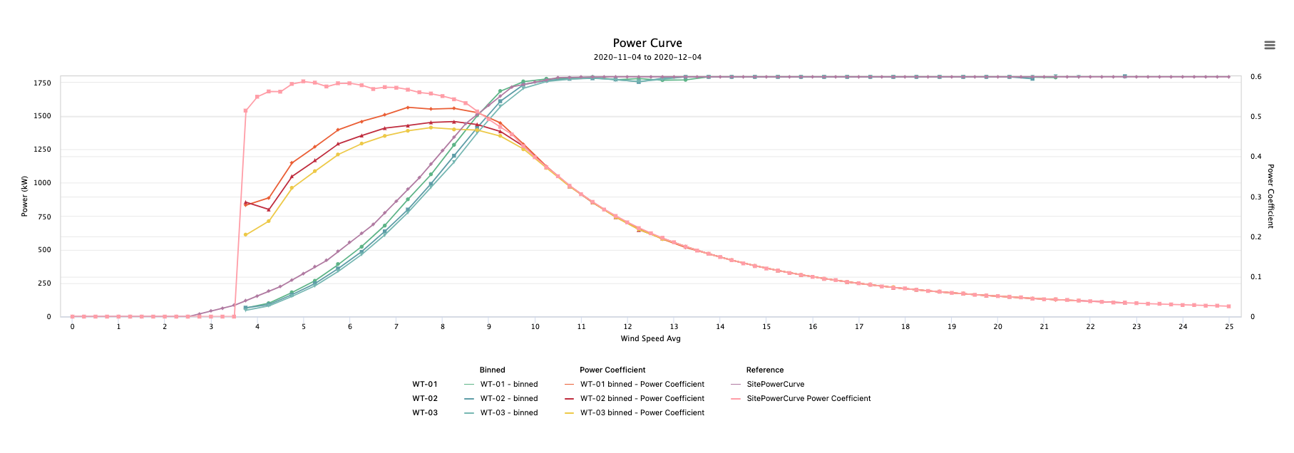
Fetch Betz Limit Power Curve is a checkbox that plots the theoretical max power production of the wind turbine. The Betz Limit (max possible power (kW)) is calculated as 59.3% of 0.5DensityArea*Windspeed_Avg^3/1000.
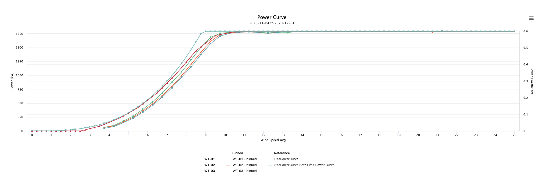
- Fetch Power Coefficient is a checkbox that plots the the Power Coefficient which is a measure of wind turbine efficiency calculated by Cp = Power (kW) 1000/ (0.5DensityAreaWindSpeed_Avg^3). This Coefficient is then plotted on Y2 in the power curve plot.
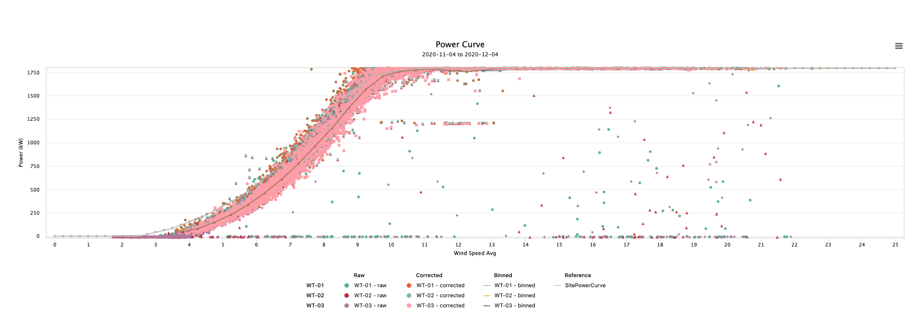
- Fetch Raw and Corrected Values (Scatter) is a checkbox that would turn on the scatter plot layers of both the raw data (all points) and the corrected data (all data that is within the selected filters). The corrected values are the data behind the binned power curve.
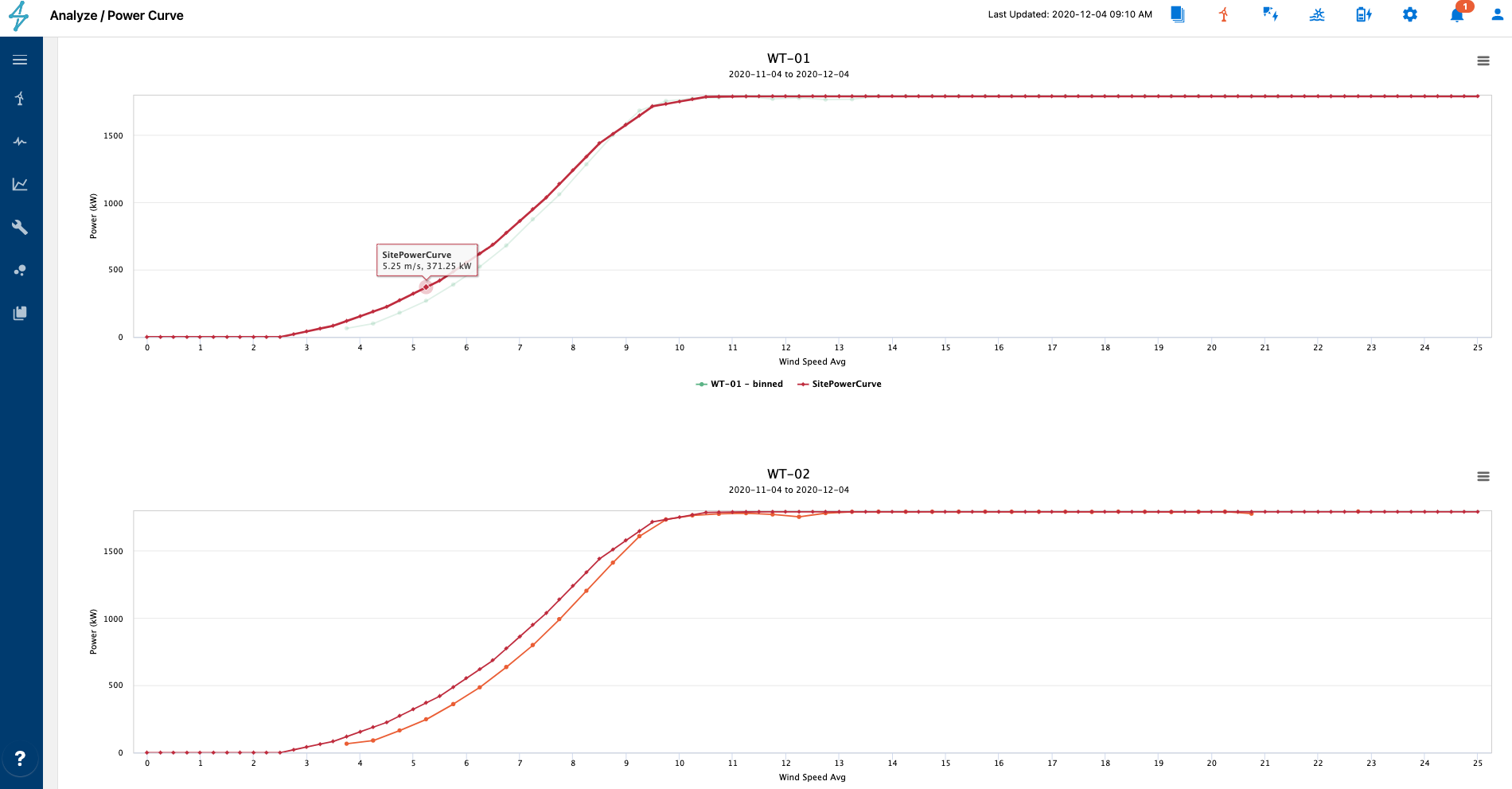
- Splitting by devices checkbox will allow you to plot multiple devices’ (turbines) power curves on the same plot or in multiple plots displayed beneath each other. You can toggle this checkbox on/off after the plot has been created without having to click plot again.
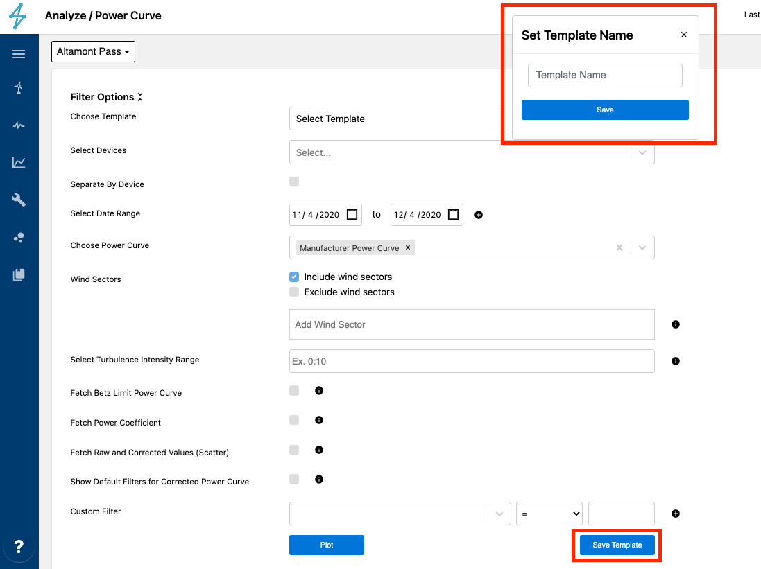
- Save Template saves these inputs as a template that can allow you to come back to this page and re-run the same set of filters at a later time. This can be both helpful for common plots as well as collaboration with colleagues as these templates can be seen by anyone with permission access to the asset.