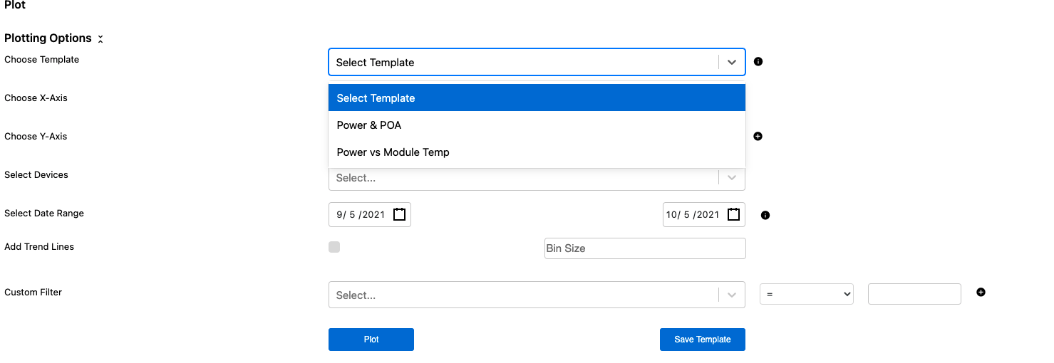
The Plot Module allows users to create scatter plots (X vs Y plots) with any data that is in the platform. This allows users to perform ad hoc analysis or create saved templates for commonly used trends to analyze site or device performance.
The Plot Module can be accessed from the left toolbar under Analyze.
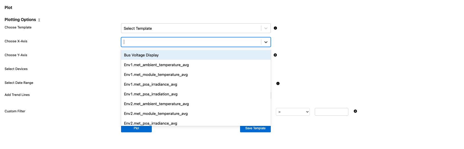
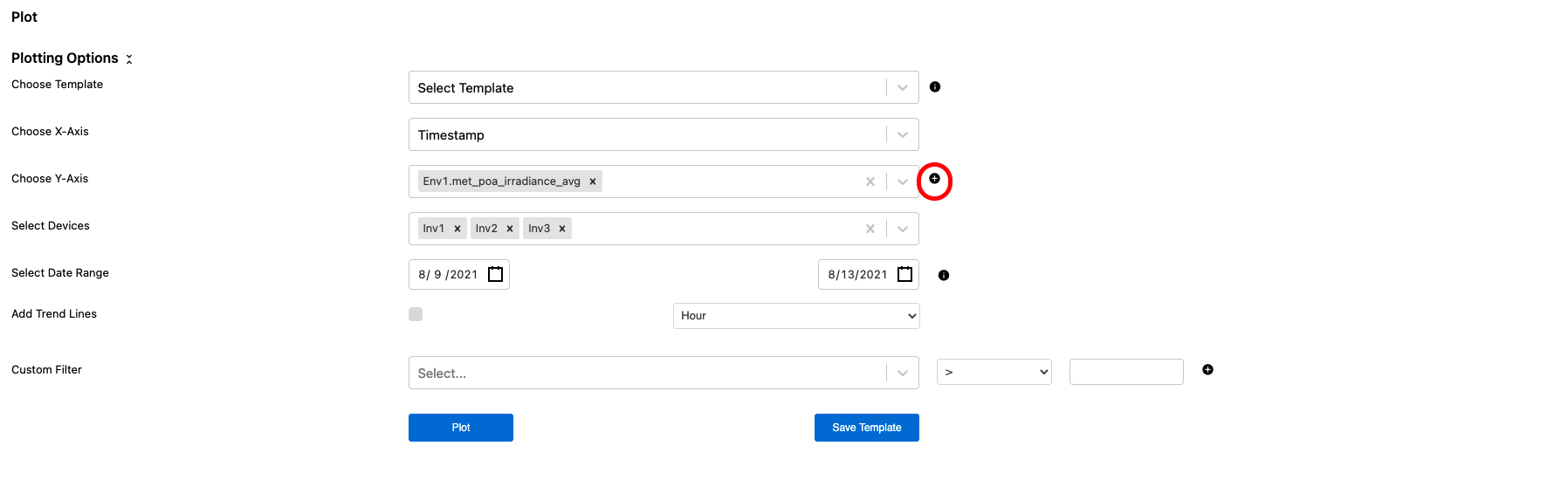
Once in the Plot Module users have access to create two axis plots of all data available in the Renewables Suite Platform for specific devices and time frames. To create a plot, users can select variables for the X and Y-Axis from drop down menus or start typing to search for specific variables they are looking to plot.
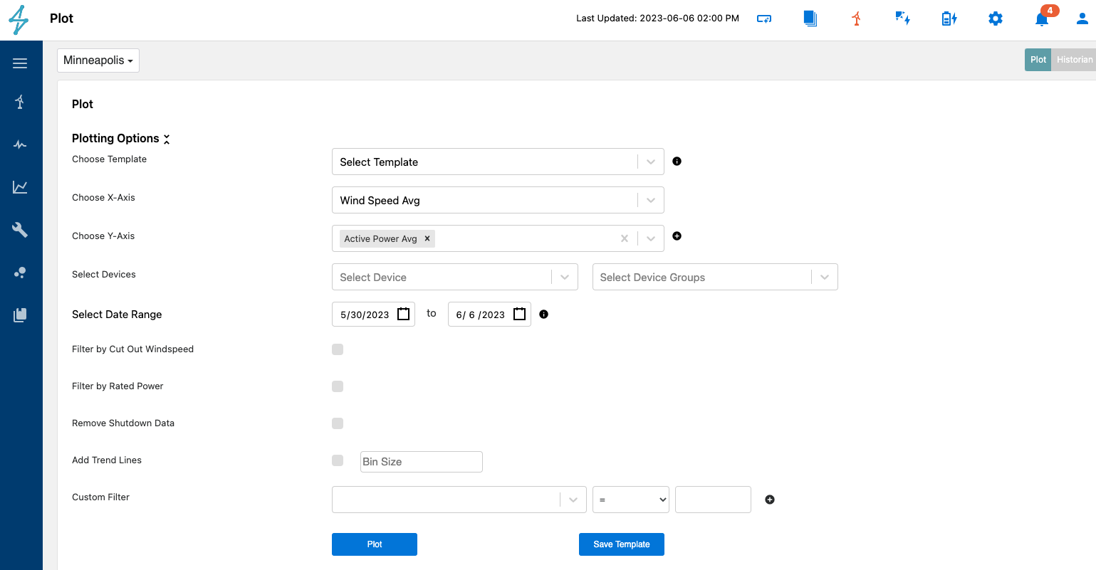
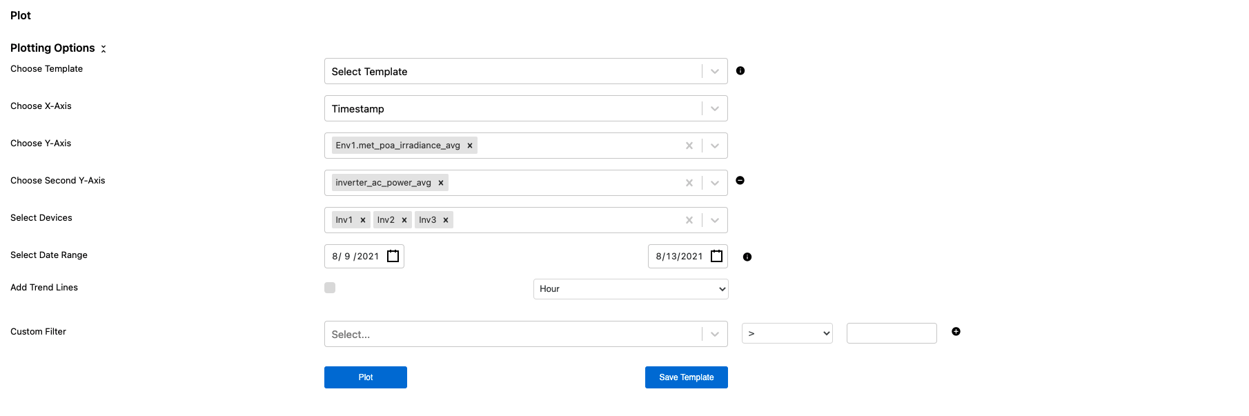
Users can plot multiple variables on the Y-Axis or they can add a second axis to plot them on to help with scaling issues that may be present with different variables on the same Y-Axis
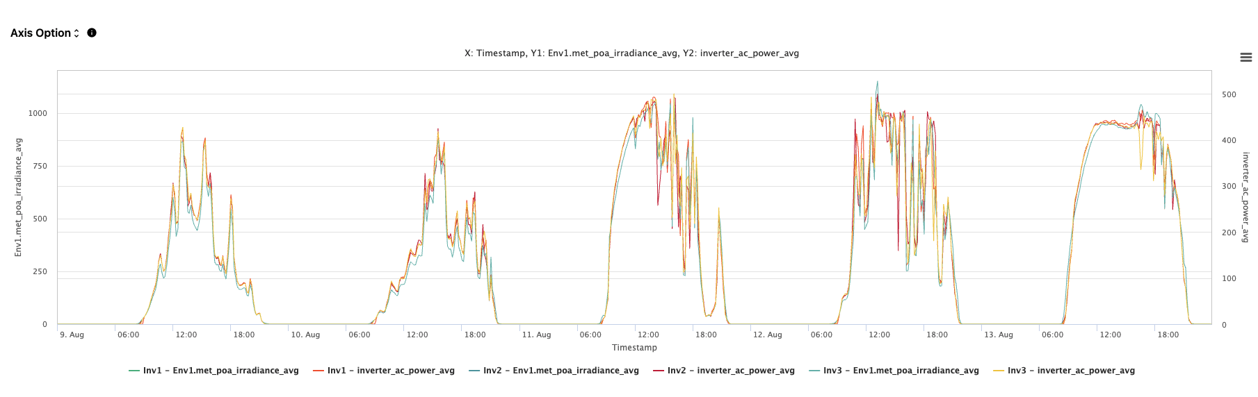
Once the desired variables, devices, and time frames have been selected, the information is plotted in a chart below the Plotting Options view.
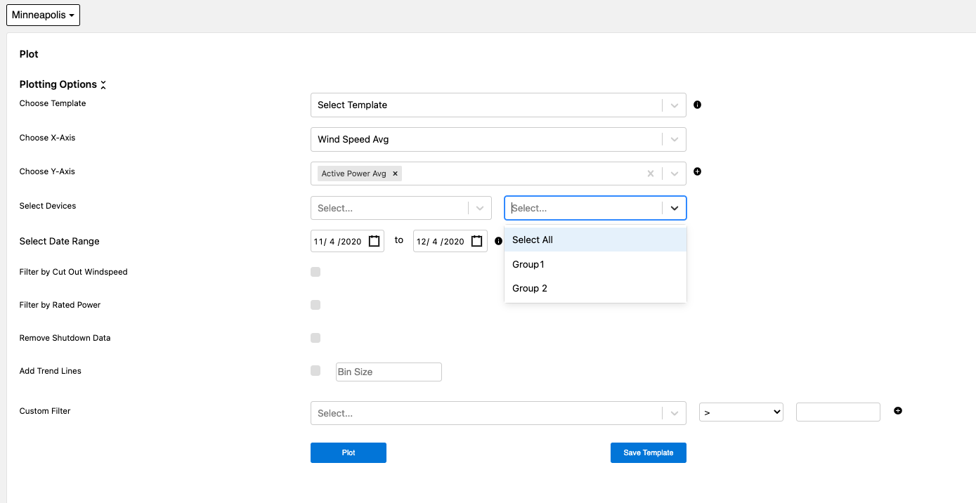
Users can also select groups of devices to plot if these have been created under Admin settings as Device Groups. This can be found HERE.
A powerful feature of the Plot Module is the ability to plot data points against each other and not just in time series. For example, users can plot the module temperature readings against inverter AC power output to try to determine trends in performance as temperature increases.
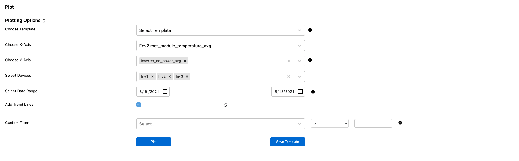
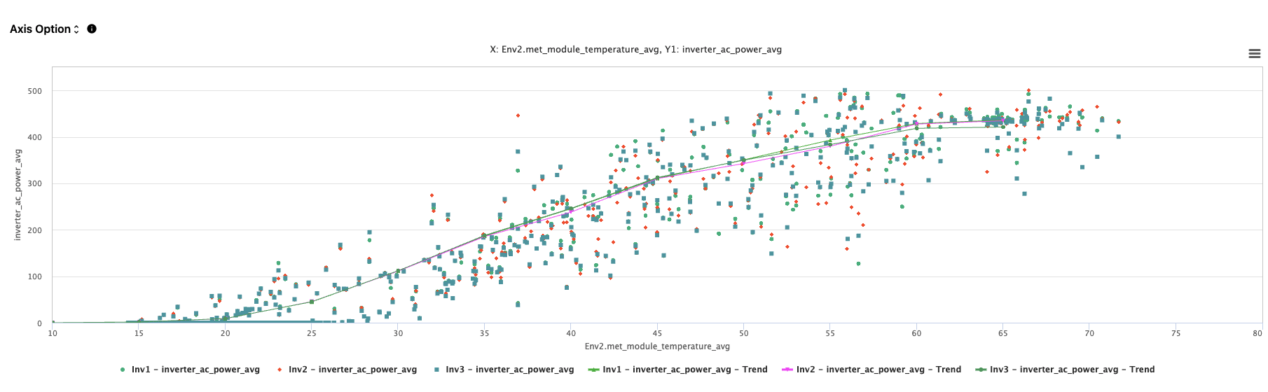
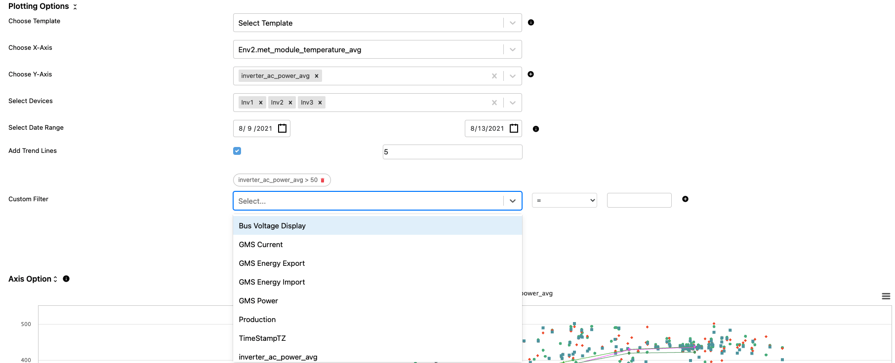
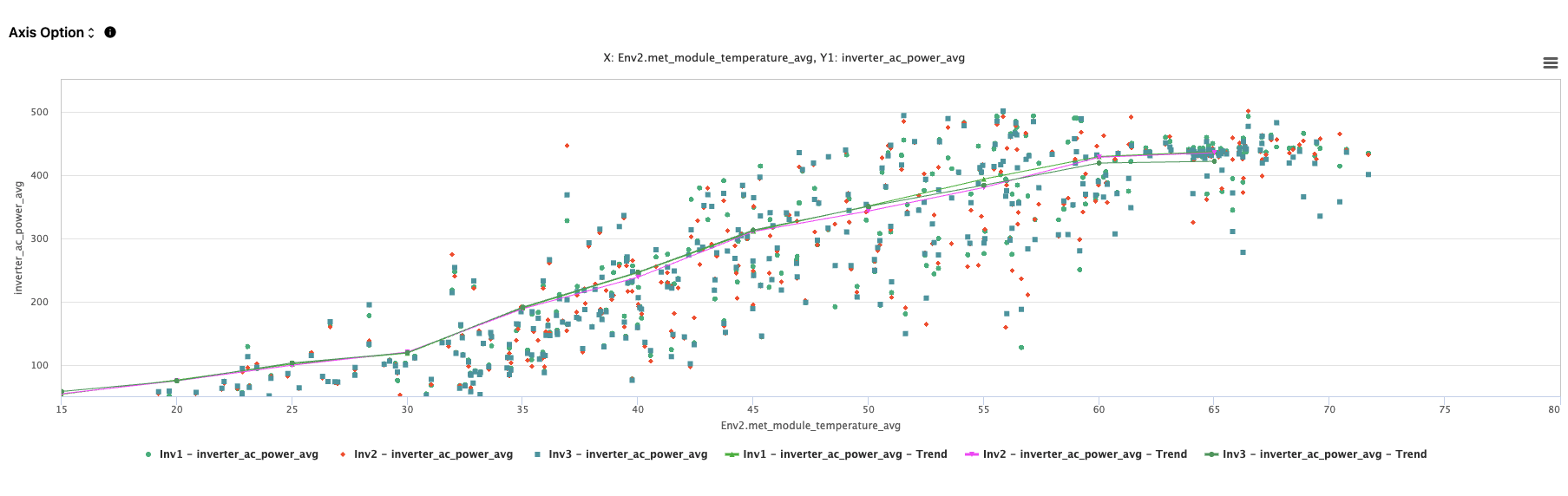
Trend lines and custom filters can also be added to further help identify helpful patterns in the data. To add a trend line, users simply check the box to Add Trend Lines and select a bin size based on the data they are plotting.
To add custom filters, users can select variables they would like to include a filter for. In this instance points where Inverter AC Power is less than 50 are being filtered out from the plot.
Users can adjust the axis scaling by by clicking the arrows next to Axis Option. This opens another menu to allow for X-Axis and Y-Axis scaling.
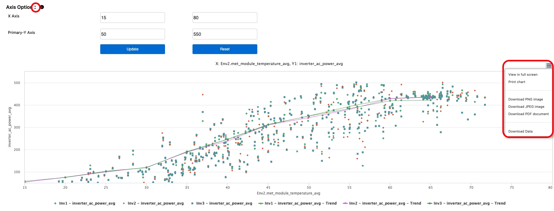
Above the right corner of the plot, users can open another menu with further plot options such as,
- View in Full Screen
- Print Chart
- Download PNG Image
- Download JPG Image
- Download PDF Document
- Download Data
Users can also plot Predicted values vs Actual values as calculated in the Predict module models. This can be helpful for conducting analysis based on the Predicted values to identify underperforming time periods or trends.
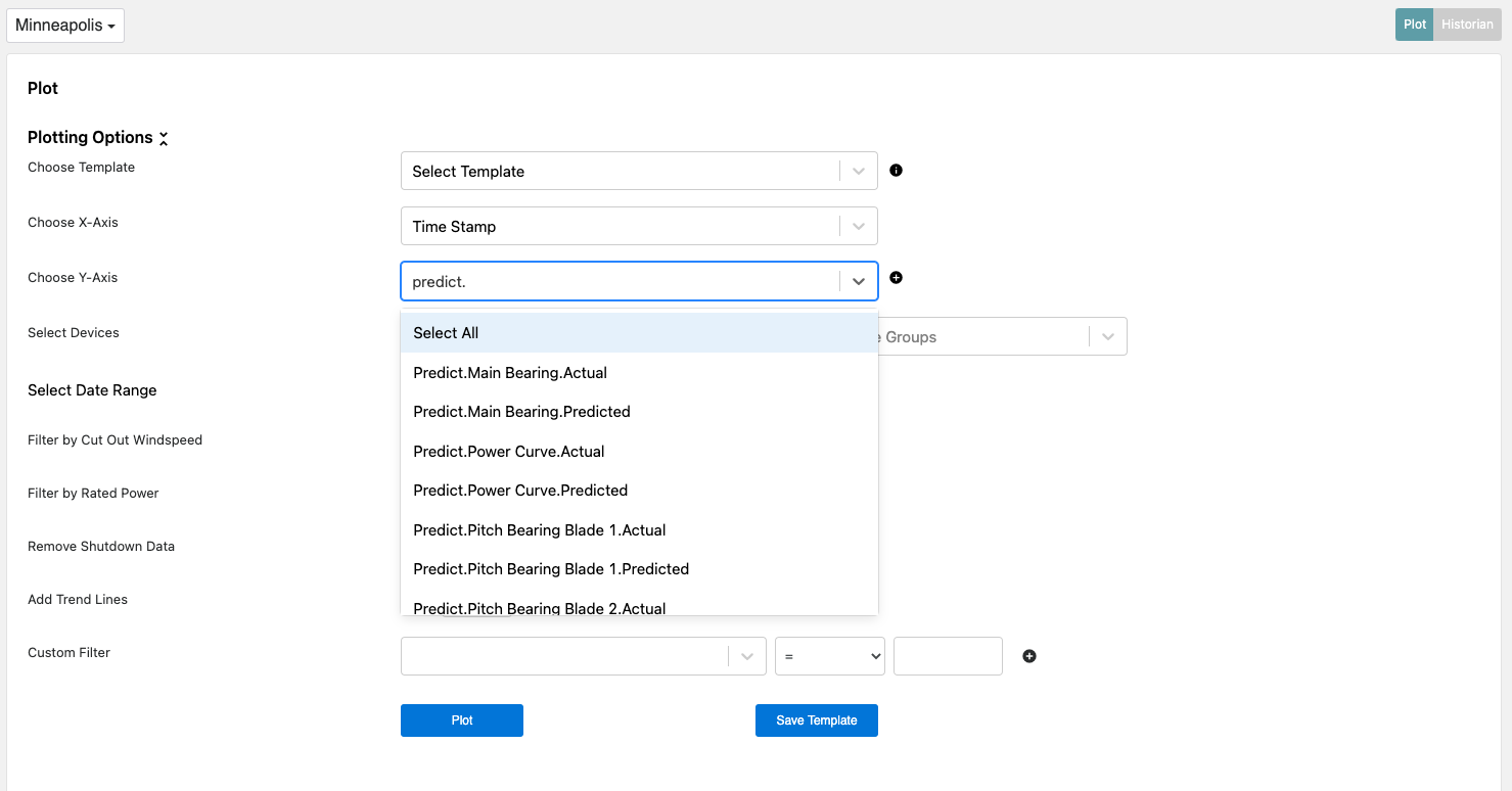
To find the Predicted and Actual values, simply type in predict into the Y-Axis to show the available model options for trending. The variables follow the tag format Predict. for the first part of the tag name.
Users can plot Reference values used in the Availability module for further analysis as well. Similar to plotting the predicted values, this can be useful for diagnosing underperforming devices or time periods.
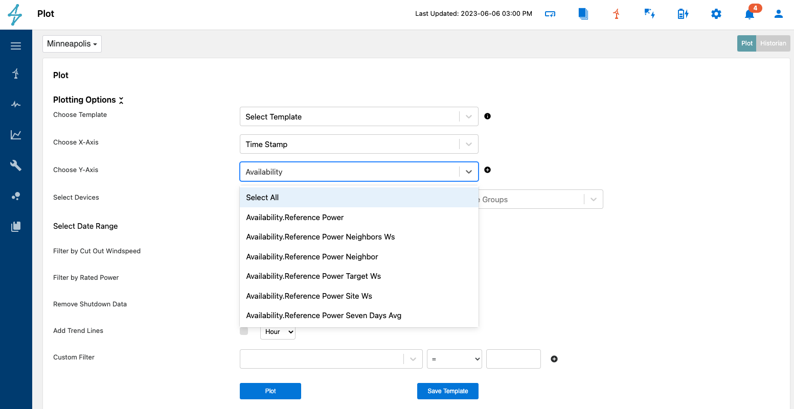
To find the reference energy values, users can type Availability into the Y-Axis to bring up the reference values from the Availability module. The variables follow the tag format Availability. Reference for the first part of the tag name.
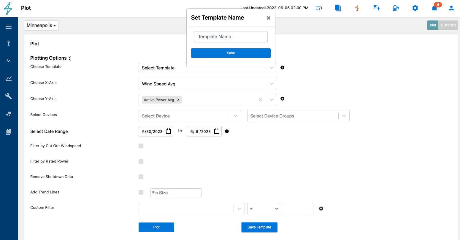
Finally if users plan on frequently trending the selected data points over different date ranges, they can save a template of the plot by selecting Save Template. This will allow them to choose the saved template from the top dropdown menu.