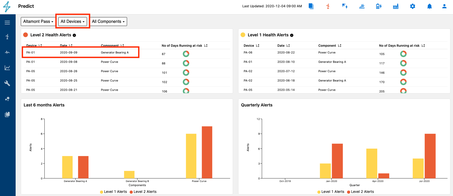
The Predict module displays a summary of site components with Level 1 and Level 2 health alerts. A Level 1 alert is an early stage issue, while a Level 2 alert is a more advanced stage issue.
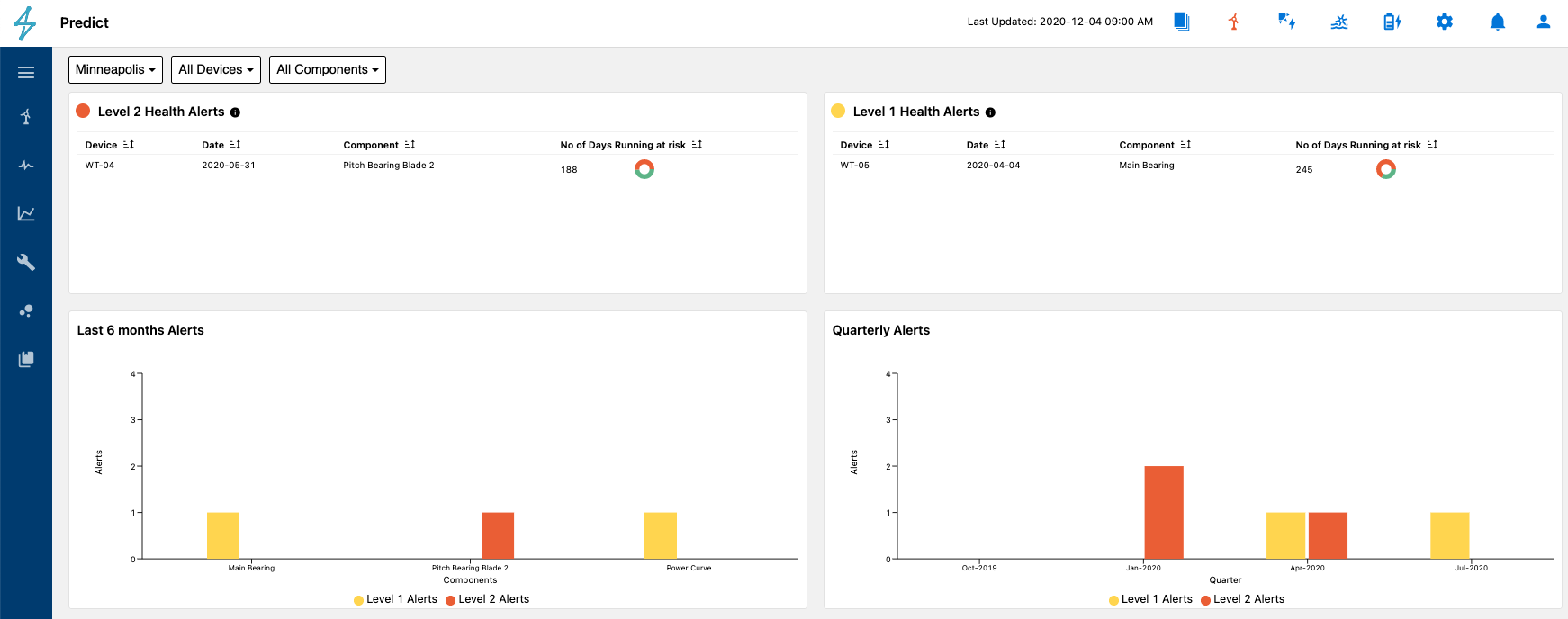
Summary of Predictive Analytics Status
Each Health Alert widget displays some basic information about the alert including Device, Date, Component, and No of Days Running at risk.. This allows users to evaluate which health alert they would like to hone in on first.
Selecting the health alert brings users to the Contributing Factors page. This can be done by clicking on an alert in the Health Alert table or selecting a specific device in the drop down menu at the top.
Selecting and deselecting the Component in the legend below the plot will remove our add trend lines from the Device health alert plot. This can be helpful if you are only wanting to see one component health score trended.
Each line is color coded based on the current status of the Health Alert. For instance if the health score appears to be declining, but it is still green it may not have yet reached the Level 1 alert status threshold.
- Level 1 Alert: Early Stage Issue - Yellow
- Level 2 Alert: Late Stage Issue - Red
Also of note is the Alert box on the line itself. That depicts when the Health Alert was issued or closed. Hovering your mouse tip over it will display additional information about the alert.
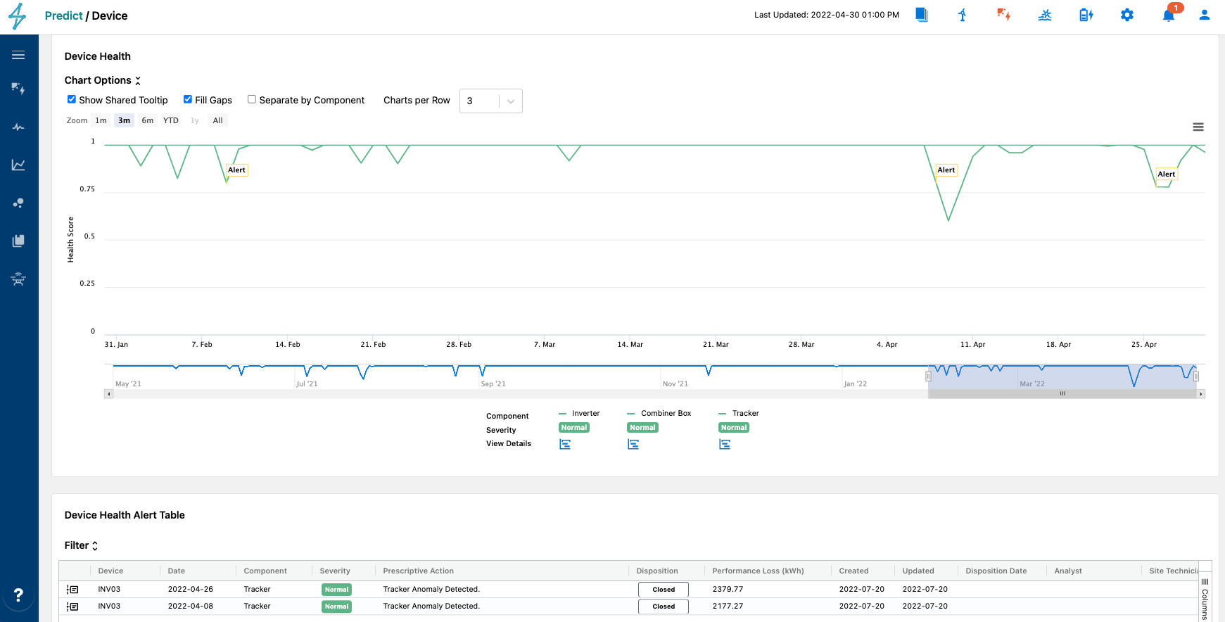
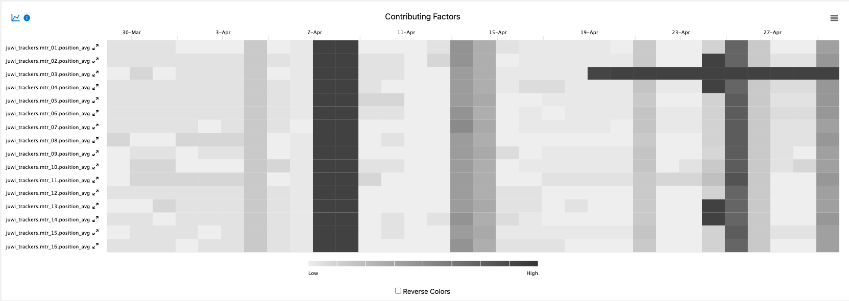
Selecting the View Details icon below the Device Health Score plot under the specific component model legend takes Users to a more detailed view of the Health Score plotted over time as well as a Contributing Factors heat map.
Alternatively selecting the desired component from the drop down menu at the top of the Device Health chart will take users to the Actual vs. Predicted page as well.

Below the Health Score plot is the Contributing Factors heat map for that specific Predict model. This is helpful for determining the main contributing factors impacting the health score decline for the specific health score alert. By utilizing this heat map users can create a drilled down plan of attack for returning their device to full health and reducing energy loss at that site.
Selecting Energy Loss tab takes Users to a more detailed view of the Health Score plotted over time as well as additional information depending on the asset class and component model. This is called the Energy Loss page.
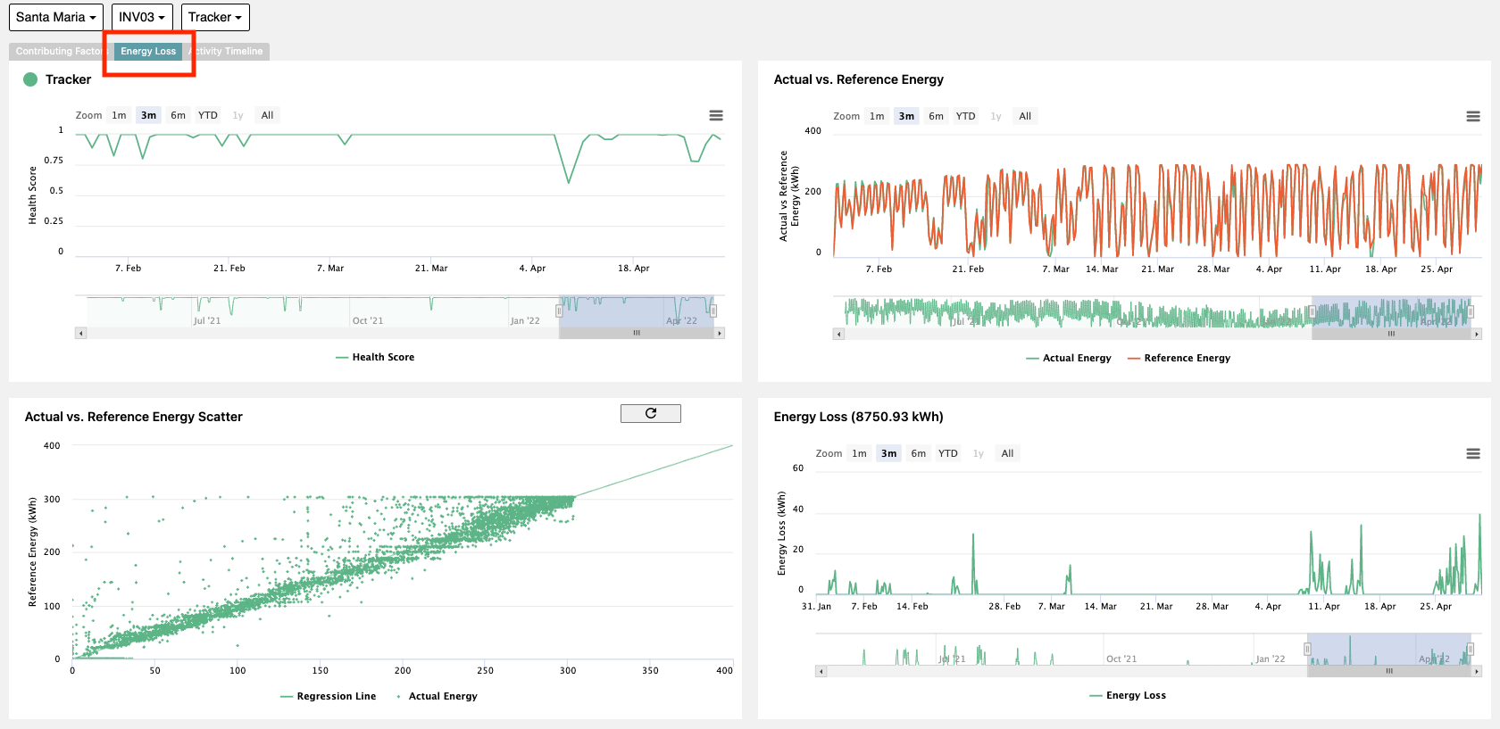
On this Energy Loss page there are four different plots.
- Health Score Time Series: Shows the decline in health score over time
- Actual vs. Reference Energy Scatter: Creates a regression of Actual Energy and calculated Reference Energy values to help visual deviation from a linear regression relationship
- Actual vs. Reference Energy Time Series: Plots Actual Energy and Reference Energy values over time to show the delta
- Energy Loss: Shows the cumulative energy loss associated with this component health score decline over time based on the selection window selected below the plot.
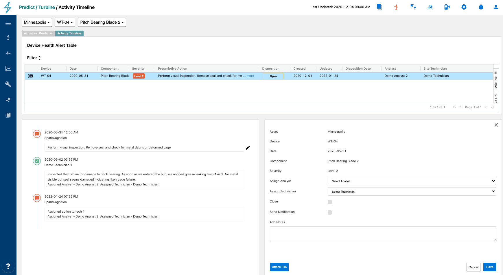
In the Activity Timeline tab, users can see the activity history of each specific alert as well as assign actions, add notes and attachments, and close out alerts.
📘
Health Alert management in Notifications Module
Health Alerts can also be viewed and managed from the Notifications module as well. Find out more information HERE