Table of contents Asset Tab Updated over a week ago Table of contents
Accessing the Assets Tab
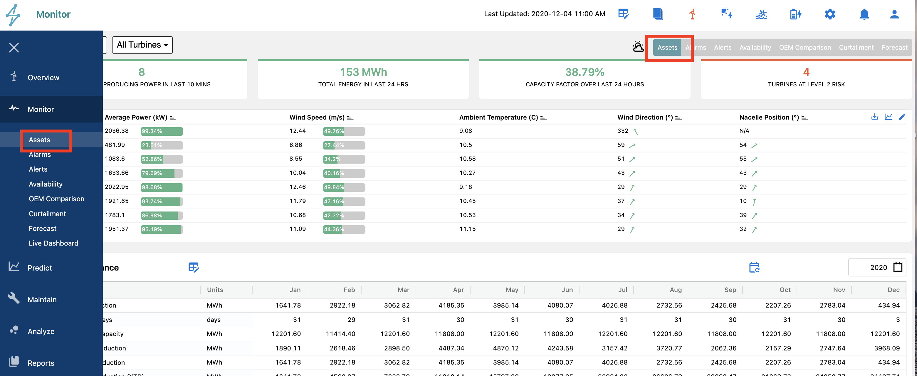
The Asset Tab can be accessed by
-
Selecting the Monitor module icon on the left toolbar, then selecting Assets or
-
Selecting the Assets Tab from the Overview Module on the top right of the view
Selecting the Monitor module icon on the left toolbar, then selecting Assets or
Selecting the Assets Tab from the Overview Module on the top right of the view
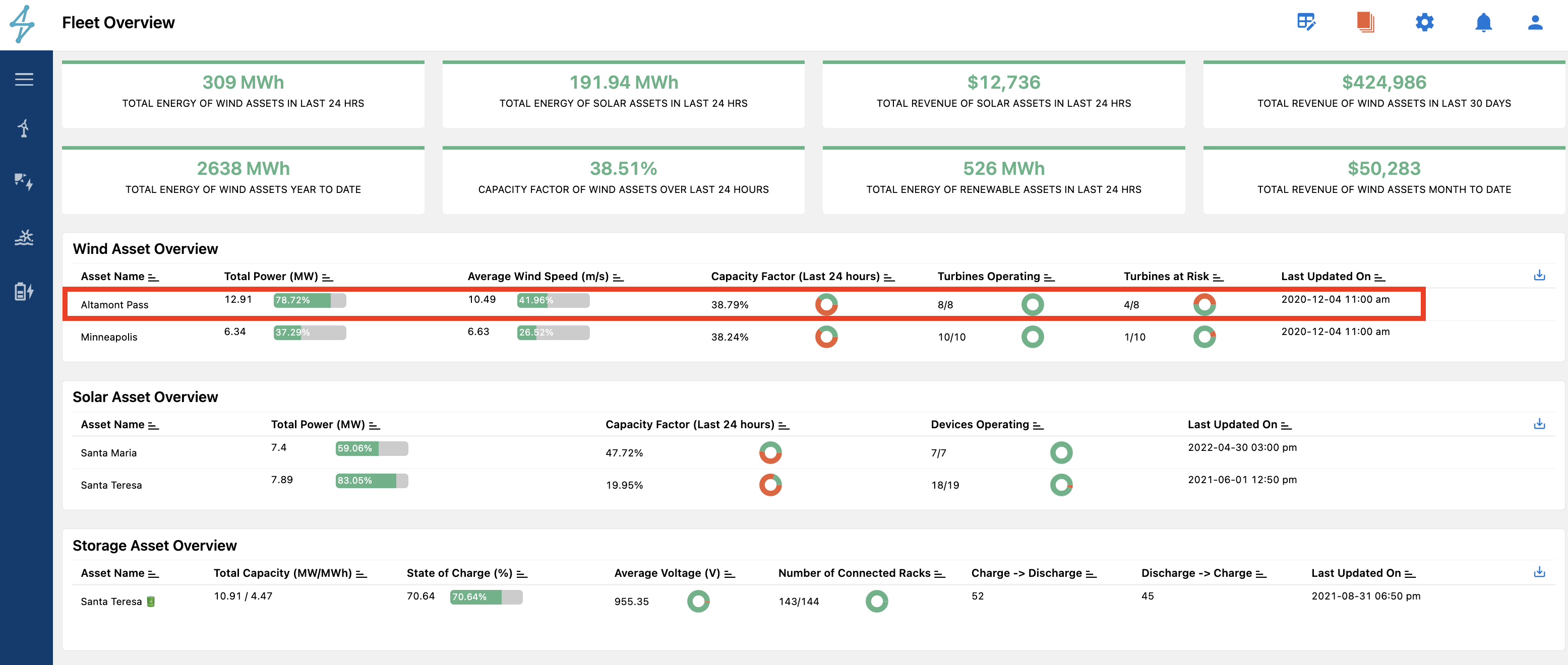
Selecting an individual Asset on the Overview Module
Features of the Assets Tab
The Assets tab enables users to quickly get an overview of project level performance, along with live performance details of each of the devices at a project. With the Assets tab, users are able to monitor in near realtime the activity of each inverter, and get an overall view of the project performance. A map view on the Assets tab allows users to see each inverter and its status compared to other nearby inverters.
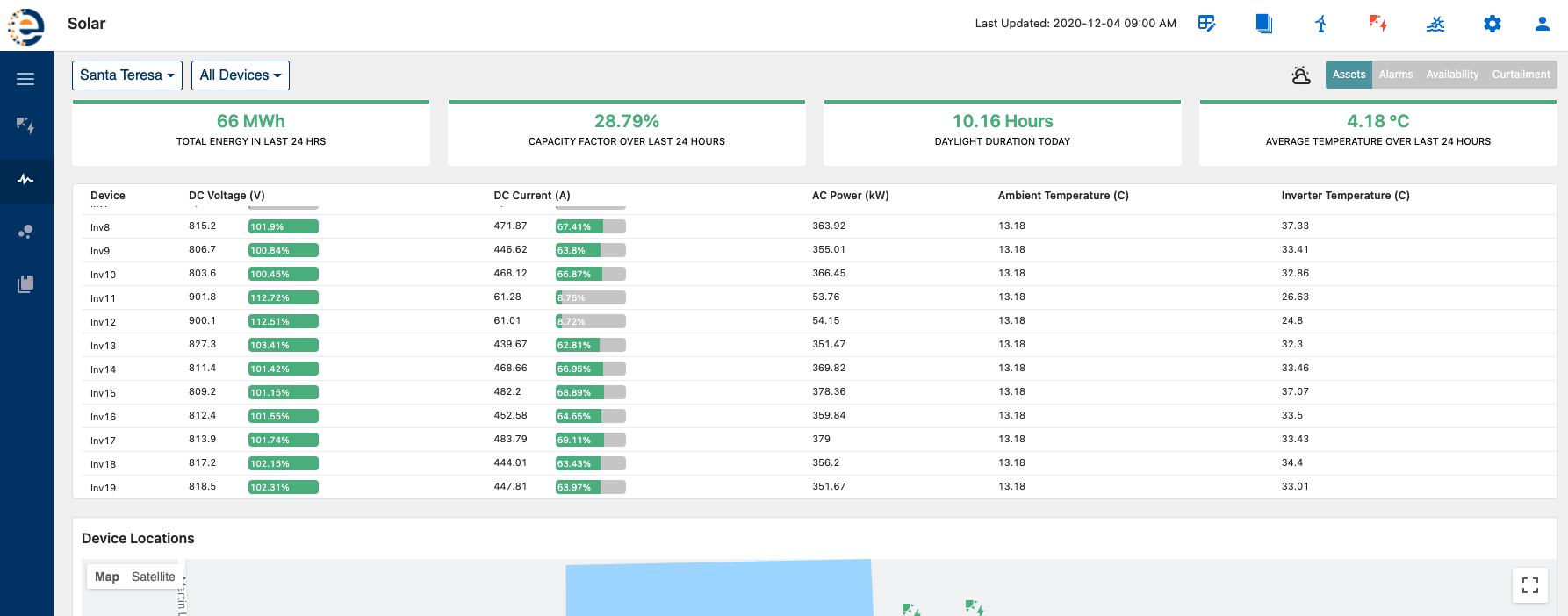
The user can dive deeper into an individual device by selecting the desired device in the Device Overview Table or by using the drop down menu on the top left of the view to select the desired Inverter the user would like to look at.

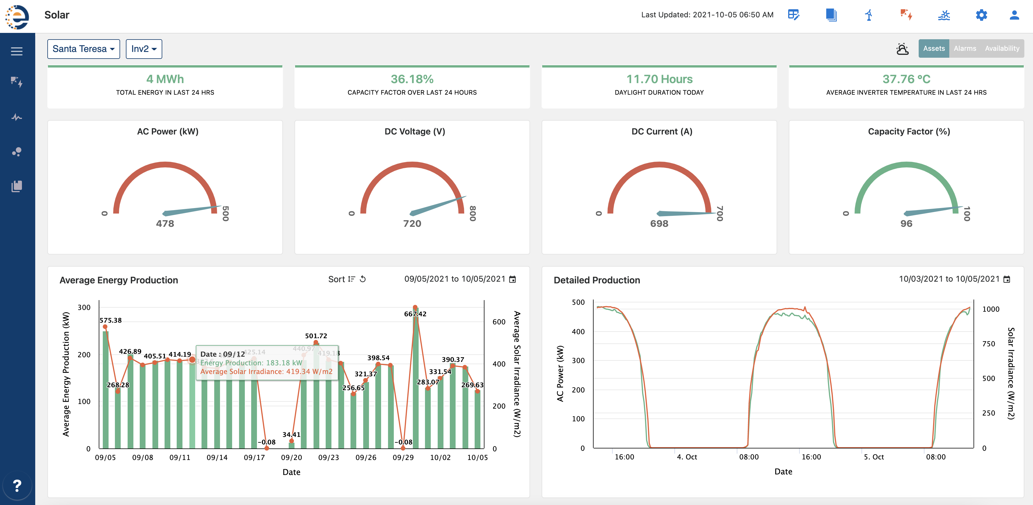
This takes users to a detailed overview of near live device performance as shown below for Inverter 2 at Santa Teresa. Users have access to a wide variety of widgets to customize their individual views based on the metrics that are important to them for viewing.
Customizable Widgets
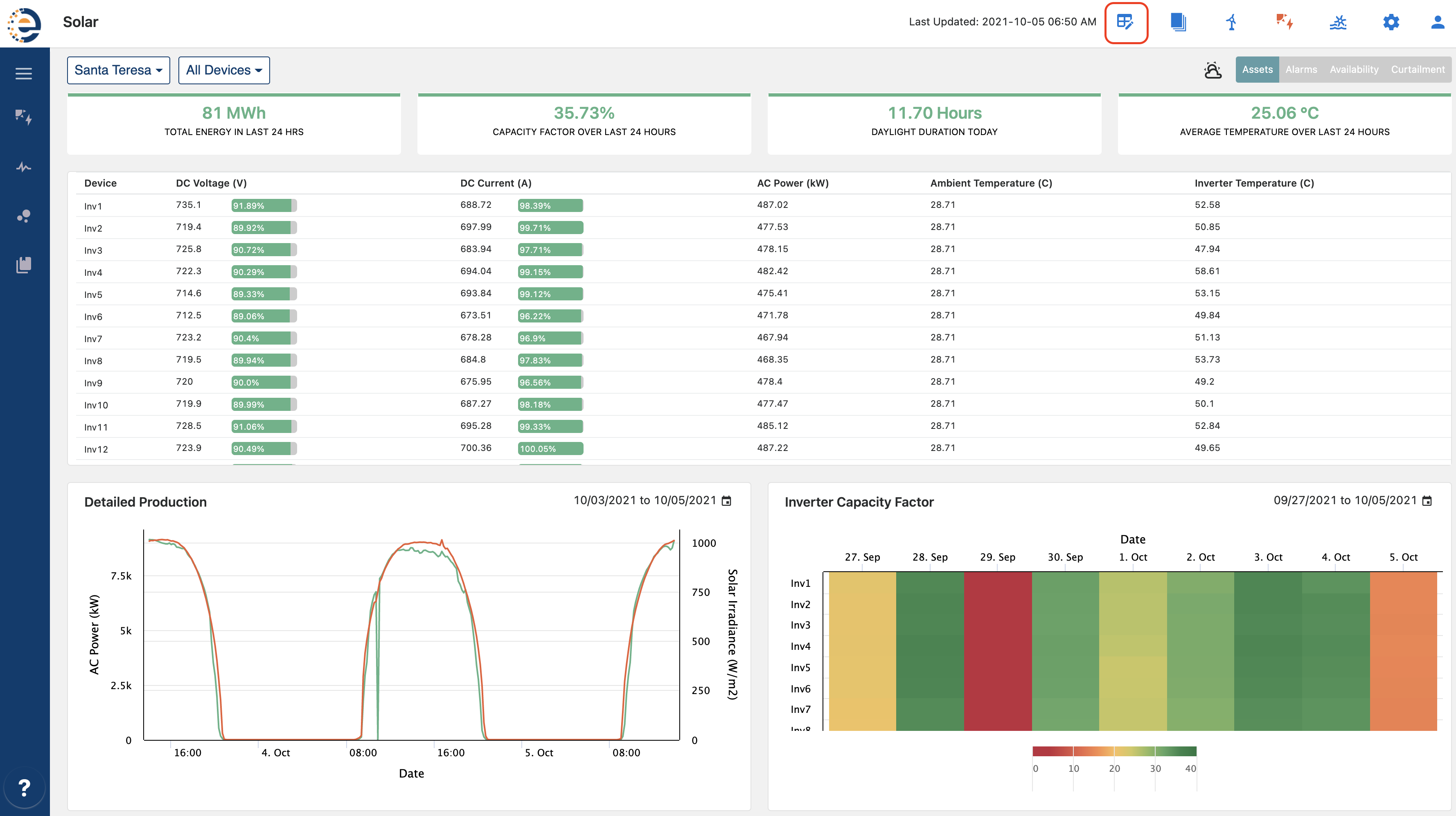
Users can customize the Assets tab for the site overview and individual devices by clicking the customize option in the top bar and selecting from a wide range of Charts, Insight KPI's, and tables to setup the page as per their individual choice.
Once the user has selected the Custom Widgets icon, a complete range of KPIs becomes available to toggle on and off on the right. These can be filtered by Widget type such as Chart, Insight Box, Map, Table, Gauge, and Drill Down Chart. The search box above the forth column from the left, shown in the image below, allows for the user to quickly find the metric or KPI they are looking to utilize. This helps to quickly find what the user is looking to display in the Asset Tab.
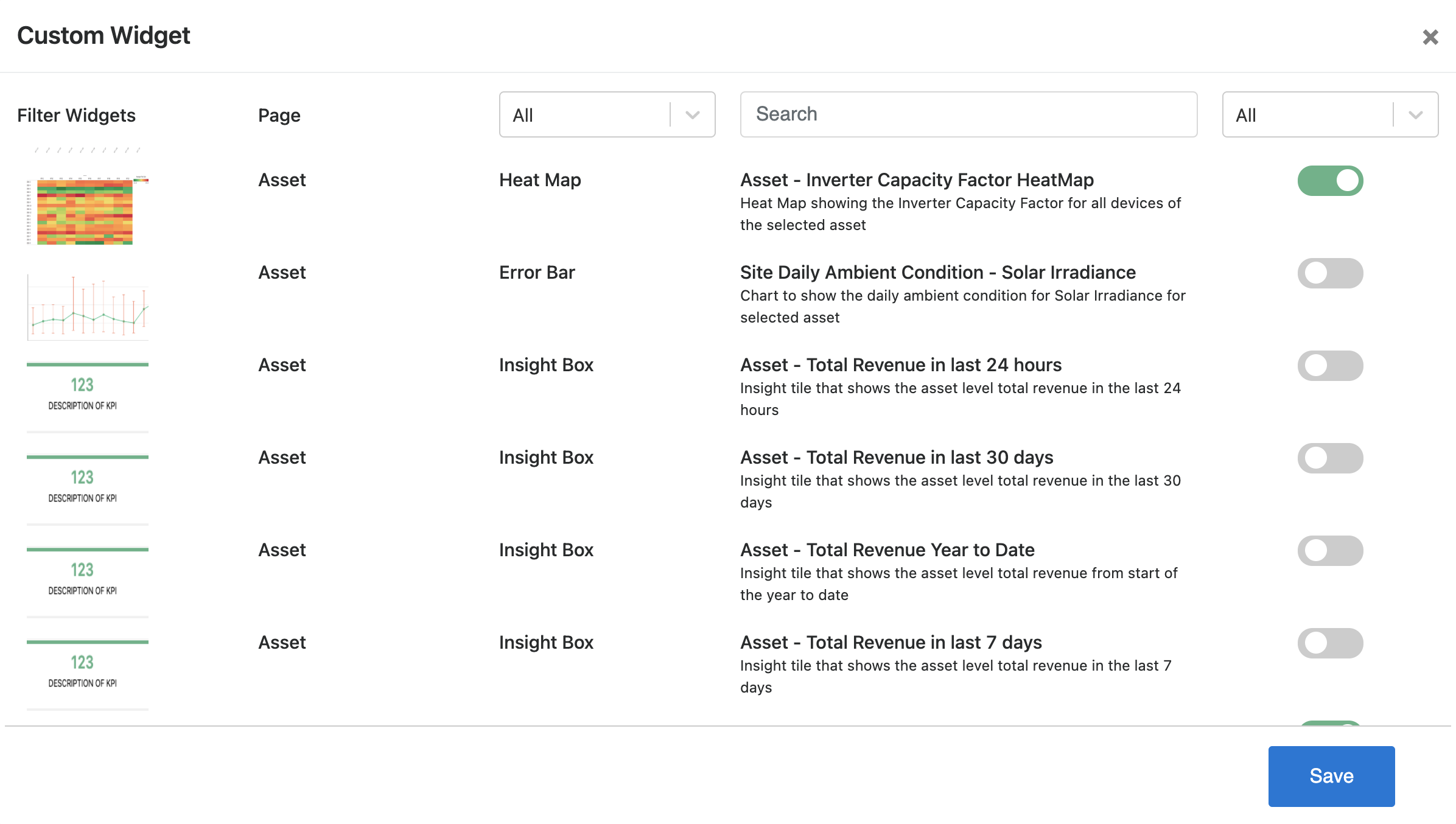
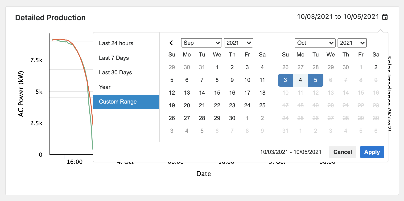
Chart ranges on the Asset Tab can also be adjusted by selecting the calendar in the top right corner of the chart to bring up a date range selection.

From the date range selection, users can select from the following to adjust the chart as they see fit.
-
Last 24 hours
-
Last 7 Days
-
Last 30 Days
-
Year
-
Custom Range
The Custom Range option allows for a customizable date range of the users choosing.
Last 24 hours
Last 7 Days
Last 30 Days
Year
Custom Range
The Custom Range option allows for a customizable date range of the users choosing.
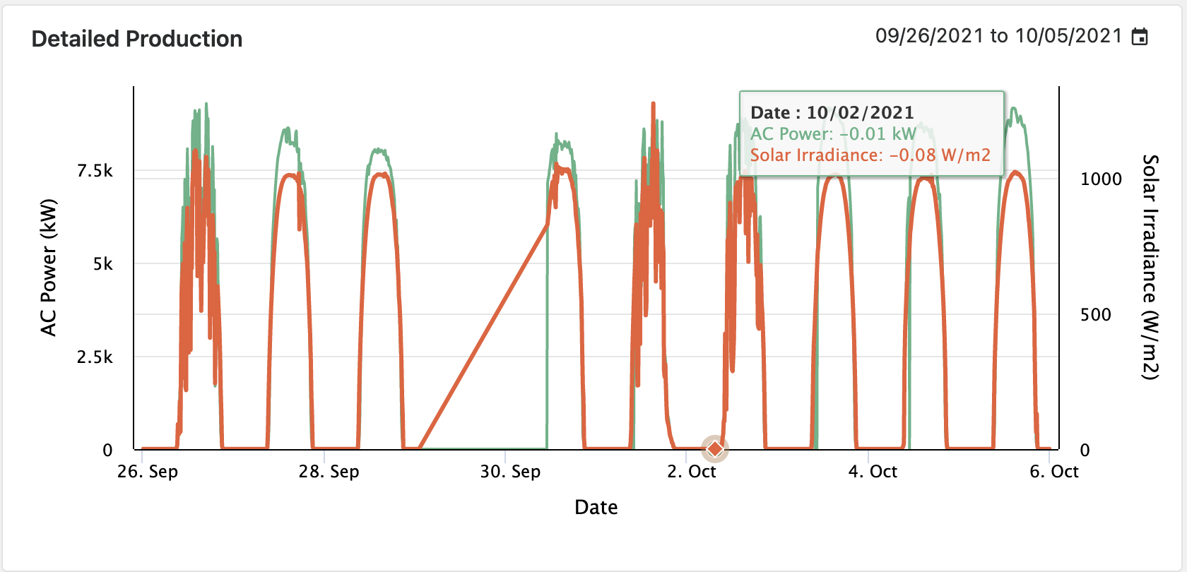
Once the new range has been selected and applied the chart automatically updates as seen in the screen capture below. In this instance users can see missing data on September 29th. This might signal for them to reach out to their site team to see if local data is available for recovery.
📘Customizable WIdgets
Changes to the Widgets viewed on the Assets Tab are unique to each individual user. This allows for each user to create a view that is most beneficial to them.
Asset Performance Table
The Asset Performance Table widget allows users to get a quick overview of the project for the selected year to date. The Asset Performance table includes all major KPI's such as Actual vs. Budgeted Energy Production, Weather Conditions, Capacity Factor, Performance Ratio and Availability Information etc.
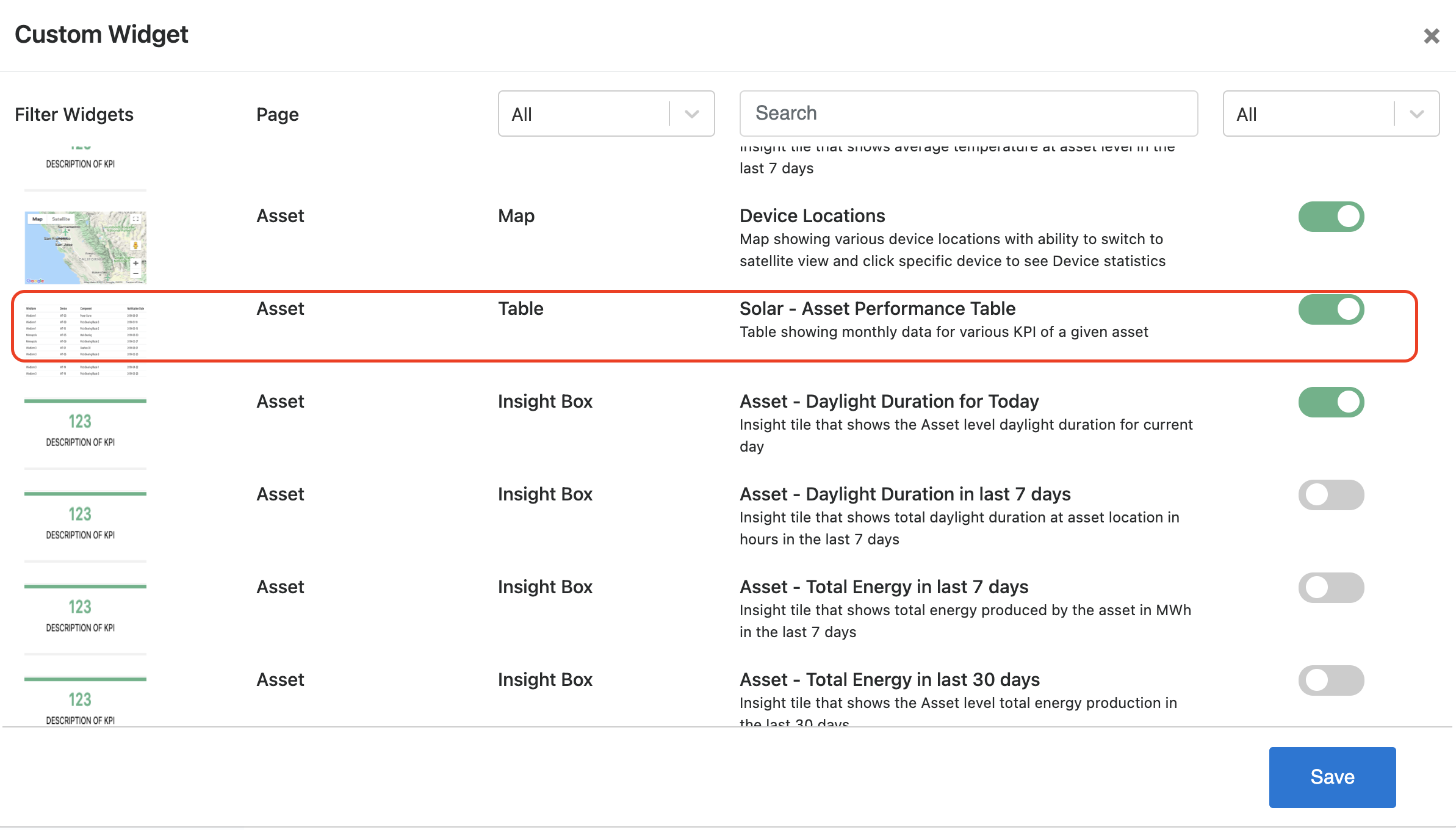
The Asset Performance Table, if not already present on the Asset Tab, can be added through the customizable widgets process described in the section above.
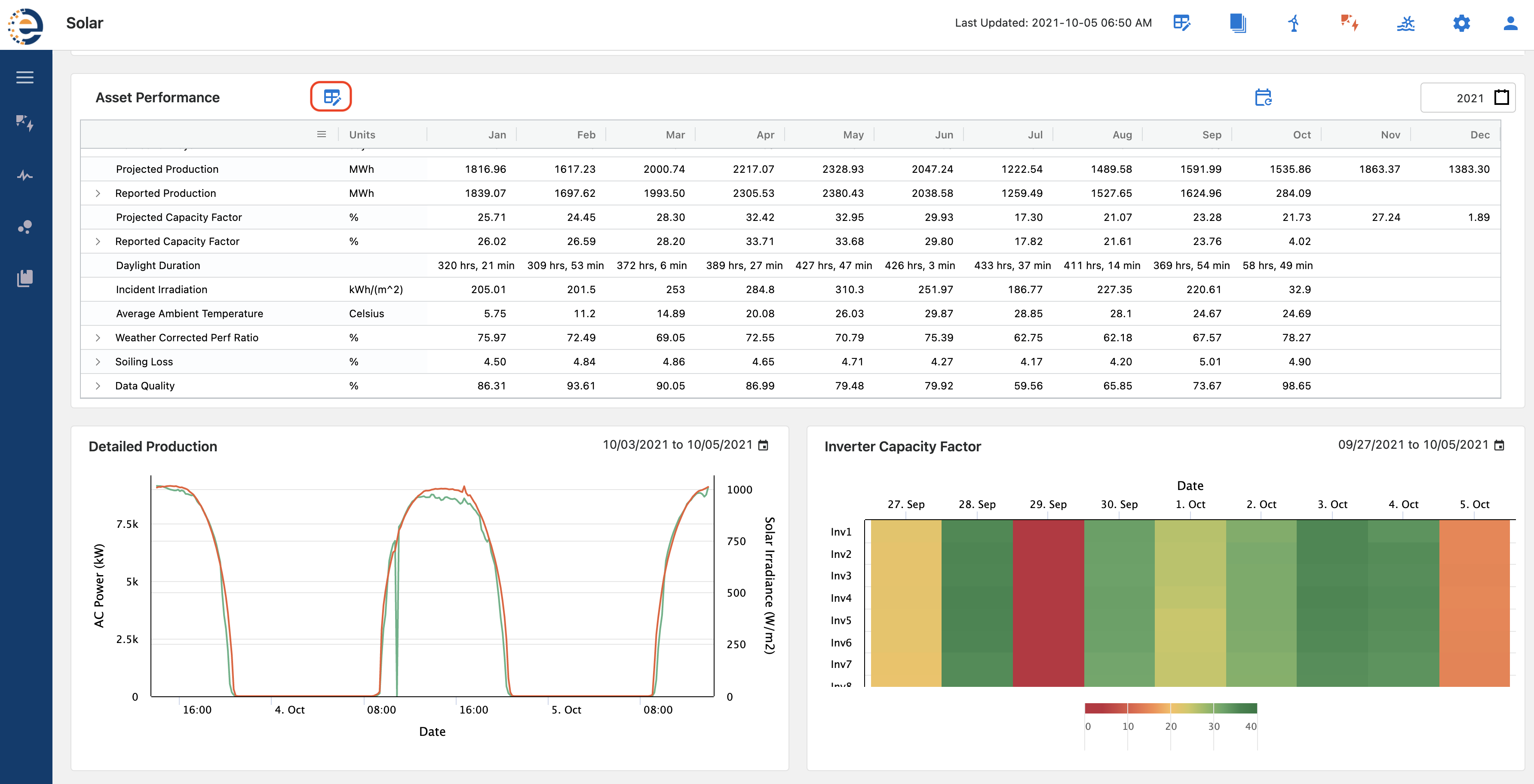
The Asset Performance widget is comprised of over 35 KPI's from various categories such as Performance Metrics, Budgeted Production, and Weather Conditions.
To customize the Asset Performance table click the Edit Icon on top of the table. The edit window opens a popup where users can be re-organize the fields in desired order of display by dragging and reordering the fields.
To customize the field name e.g. to change display name of Grid Curtailment to Utility Curtailment simply double click the Custom Field Name cell and enter the desired field name. To show or hide a particular KPI from the UI check or uncheck the Display column. Once done editing click Save and close the popup. This will result in reloading of the table and all changes would be effective immediately.
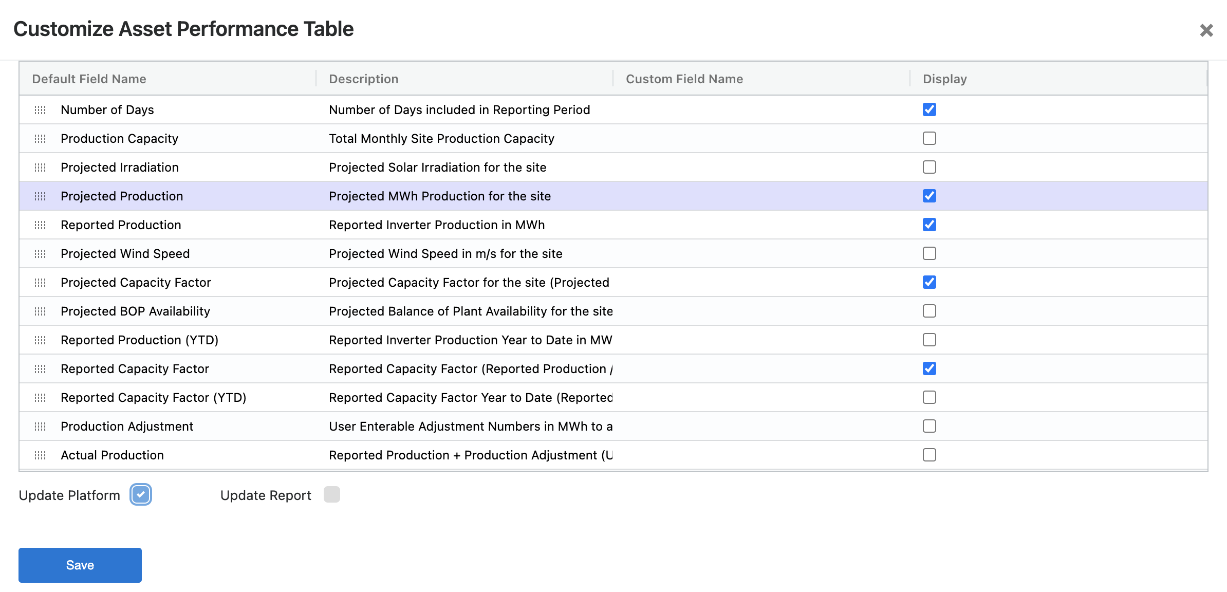
Users have two options to select from prior to saving.
-
Update Platform
-
Update Report
Update Platform
Update Report
Update Platform updates the Asset Performance table and not the Asset Performance table in reports. Selecting Update Report brings up the metrics currently displayed in the report and allows users to update those without changing the Asset Performance Table view on the platform.
🚧Asset Performance Table Customizations
Any changes made to Customize Asset Performance table are visible to all users across the Asset. Every user at the asset will see any display name or table organization changes. If you are unsure of the settings and need help then reach out to SparkCognition Renewables Suite Support team for help with table customization.
Site Trends - Asset Overview
One beneficial widget to enable as you are setting up your Renewables Suite platform view is the Site Trends widget. This gives an overview of current site conditions, site & device status, KPIs, and recent performance. This is enabled by using the instructions above on this page for Customizable Widgets. This widget would be very beneficial for a site manager or operations team who might want to get quick information on a specific assets current status and recent performance.

The chart on the right is customizable as well by clicking on the edit pencil. This allows for selecting specific variables to appear on the plot other than those that are there by default.
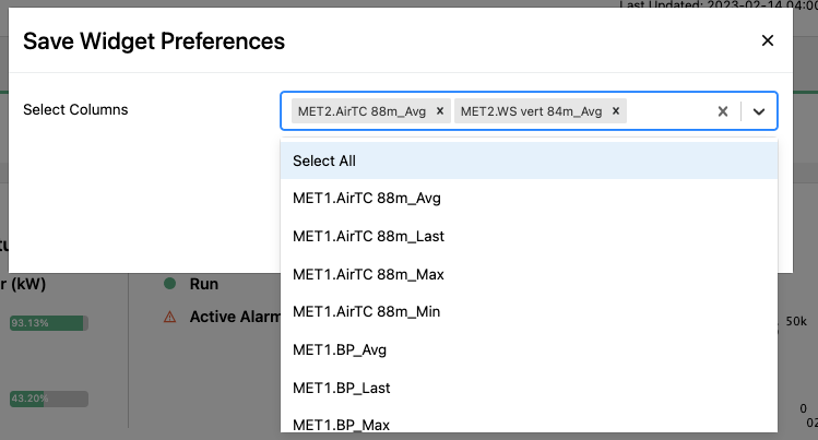
Device Trend Plot Table - Asset Overview
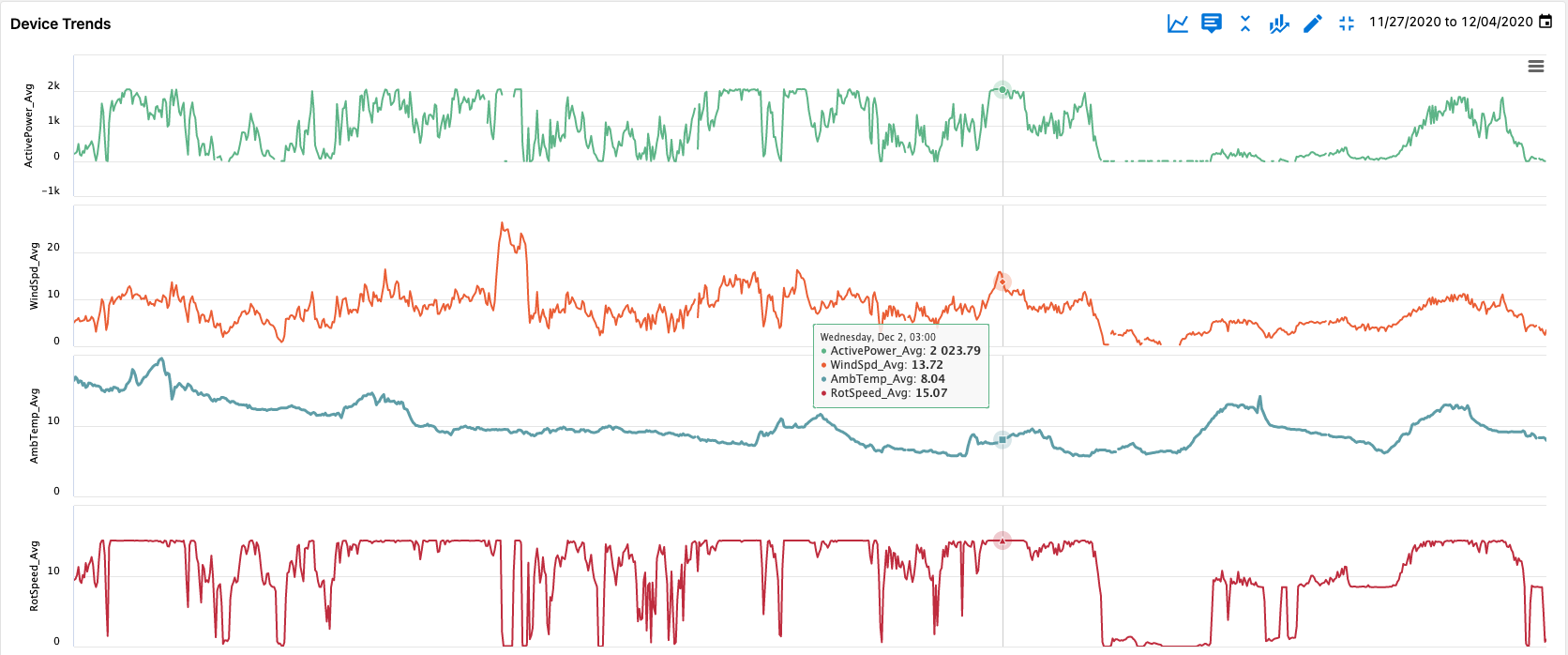
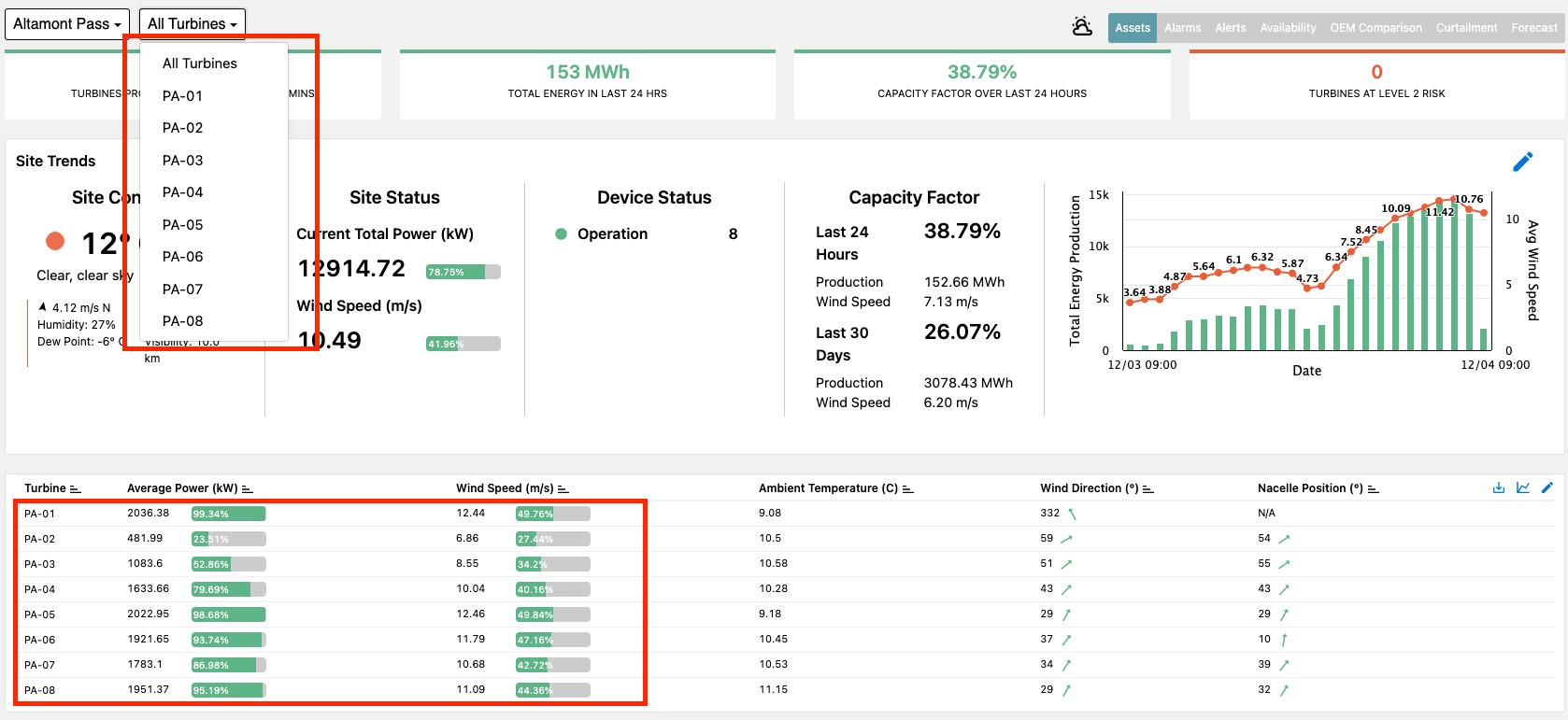
Device Trends is another helpful widget that can be enabled to help users quickly do a deeper dive and perform quick visual checks on the performance of each turbine compared to its peers. This is enabled by using the instructions above on this page for Customizable Widgets.
This widget can be beneficial for site managers, technicians, operators, and analysts to perform quick comparisons of turbine performance and help identify outliers on the main asset overview page.

The widget itself is also customizable by clicking the edit pencil in the top right column of the widget. Options for customization include selecting different default variables and changing chart type.
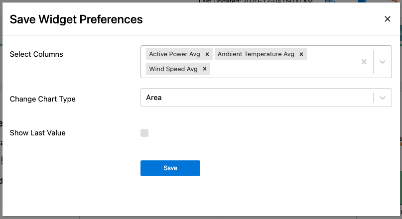
Users can also toggle between last 7 days and area versus line chart options in the top right option bar as well.

Device Trends - Device Overview
Another helpful widget to enable is on the Device Overview page which is accessed by clicking on a specific turbine in the device overview table or selecting a specific device from the dropdown menu on the top navigation bar.
Bringing up the custom widgets menu the Device Trends widget can be enabled.

The Device Trends widget, much like those listed above, help users more efficiently do their jobs by providing pre-made plots of important variables for users to quickly do an analysis of a device that may not be performing as well as it should.

The widget has a lot of customizable functionality as well and allows users to select variables to automatically plot that are important to their operations. This is done by selecting the edit pencil to bring up the Widget Preferences menu.
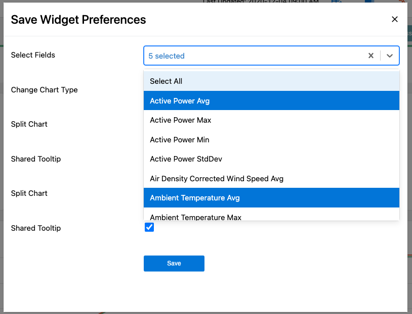
Here users can pick the variables they would like to plot as well as set their preferences for if they would like to engage the Shared Tooltip feature or Split Chart views. Splitting the chart may make the information more easily digestible, but this is based on personal preference.
